MONOTYPE - SPREADS USING CUSTOM TYPEFACE
FRONT COVER -

Chosen final typeface - Me & Beth decided against using my typeface for the publication we didn't need two only one it did give us the option of a bit more variety but we decided it would be best to just use Beths also our typefaces didn't work as a set.

Storys to be used for publication -
We decided as a pair we would include QR codes on a double pages spreads so users/buyers can scan the code and receive the full story online and read about other news.
I began by making columns for the first story i had chosen.


There ended up being to much content for 1 page but not enough for a double page spread thats including the vendor code of conduct so we decided not to use this story and i picked another -
Joels story-


I was really pleased with this story because it had a lot of good imagery it was easier to place the type over the top in white and worked really well and created impact.

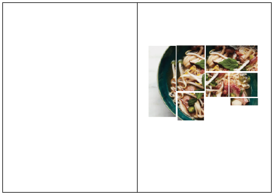
Food mockup-
I decided to make my original food page into a single page instead of a double page spread this was so i could also fit my Joels story onto there and it would well as a set.


Finished double page spread -

This double page spread is to feature Letter to my younger self -


I next decided to change the text to white as it was easier to read and bolder.


I didn't feel although the text was working very well so decided to place it into two columns.

I decided to play around with the layout more for my final spread although i liked the larger bleed image i decided that it would be better to keep more of a consistency so i added more images to the layout.

I am really pleased with my layouts i just need to meet with Beth so we can combine our designs.
No comments:
Post a Comment