ENDING THE BODY SHOP BRIEF.
Today i went and spoke with Fred and discussed how i wasn't happy with my progression made throughout my Body Shop brief. I feel as though i am going round in circles and i haven't been able to achieve the outcomes i had wanted.I originally chose to do the body shop brief as one of the first briefs i had picked. I decided to choose it as i wanted to gain more knowledge about the brand and come up with new innovative ways i could execute making promotional posters for the brand.
When beginning designing for the posters i kept coming up with ideas and just experimenting with different options from using photography to then simple designs using only type nothing i was trying seemed to be answering the brief or make me feel like i was achieving anything as i felt my design was poor. I think i made the mistake of choosing this specific brief simply because it was a cosmetic brand. When i began reading more into the brief realised how it wasn't for me and this taught me that i should always read throughout a variety of brief before just choosing one.
I tried three different methods for the design solution for this brief. I felt deflated and stressed that i couldn't come up with an appropriate resolution for the brief. I think the main reason i struggled was because i was working on the Asos brief as well when it came around to begin collaborative i was trying to balance three D&AD briefs at once among around another 5 or 6 briefs. I defiantly underestimated the depth and amount of work that needs to go into a d&ad brief to give it a strong resolution.
I felt disappointed in my self when asking if it i could leave the body shop brief as no resolution was working how i imagined and how i felt i was wasting my time and it could of been used better else where but at the same time I'm glad i made that initiative to end the brief as it gave me more time to focus on my other work and i ended up producing a resolution at a very high standard for the Asos D&AD brief.
Ive learnt of next year to consider my briefs thoroughly before selecting them also if i am struggling with a concept to manage my work load better and spend more time on different briefs to make sure i achieve what i originally wanted to. I have also learnt what style briefs suit me and what I'm interested in and what I'm not. Overall I'm disappointed i didnt finish the brief but as it benefited other areas to the module I'm glad i made that decision.
Friday, 28 February 2014
Spirograph Tests.
SPIROGRAPH TESTS
For my publication i new i was going to have some content around spirographs as they are part of geometry my friend had a really old retro spirograph set so i began making some experiments using it. I decided that i could perhaps make a set of spirographs and scan them in or use a tablet with a spirograph stencil that had large holes in the plastic.
Experimentation-

I began looking at some tutorials and realised i would be able to make my own spirograph by using shapes.
Experimentation -
Step by Step
I first created a circle

Next i moved the circle around using the transform tool

I kept repeating the circle until i achieved the look i wanted.

Final spirograph produced.


I am really glad i looked at tutorials so i was able to create my own spirographs digitally it will save me a lot of time.
Thursday, 27 February 2014
Collaborative decision making - post crit
DECISION MAKING
After mine and Beth's collaborative crit for our MONOTYPE d&ad brief we decided to have a chat to see what was the most common comment we received in our feedback and what we need to work on. We realised that some of the imagery we had chosen for our front cover wasn't really working and didn't best portray the north and maybe it wasn't very appealing and more depressing. I can see how me and Beth overlooked this element because we were focusing on the type.
We were also told that the sub header typeface didn't work with the brush font and we should consider a different style. Make something san serif. Me and Beth really like our brush font as its feels handwritten and real we feel like we want to keep that aesthetic to bring the magazine to a more modern genre and keeping the magazines ethos.
We decided that we would look back at the brief to see if we had missed anything or we could take anything away from it. We looked at the original brief and our re-written brief. It came to our attention that the brief really pushed 'new typographic system' when previously discussing this we felt asthough we wanted to use existing typefaces to make our own branding guidelines but the brief would want that as well as a typeface.
Me and Beth have decided to take on a larger challenge and try a new sub header typeface and try using a brush stroke to achieve one similar to the one we have at the moment and see which is most successful.Luckily for me and Beth as we have been working at steady pace and are very far on with our brief we already know the layout styles and how we will chop the convent and how we will execute paper size to the most appropriate choice.
As we have three weeks till submission we have enough time to design our typeface between us and experiment. Not forgetting working on our campaign. I think we are working at the right speed and have planned our time sufficiently.
Collaborative Crit
COLLABORATIVE CRIT
At the beginning of the session we began by pitching our concept to the rest of the group we were in the same groups as last weeks 3 pairs. We began by talking through some layouts we had put together , some from covers & a board with our next concept proposed over a magazine and a app.


Once we had pitched our ideas to each other we then swapped with the pair clockwise and took there work and went through thoroughly answering the following questions.
- Comment on the effectiveness of the concept.Does it address the problems indented in the brief? suggestions
- Comment on the design direction and decisions made regarding the production and distribution of the response - suggestions
- Comment on what you would do differently and why?
- If money and time were no object how far would you do with the brief based on what has been presented?
- What contextual references can you suggest will be relevant to the proposal?
Me and my partner Beth looked Joes & Alexs work we felt we gave them feedback when they pitched but after having a thorough look we managed to leave them a reasonable amount of feedback good points and some considerations. I felt this crit was beneficial.
OUR FEEDBACK
Me and Beth had our work looked at by Tristan & Bobby we received through feedback they brought points to our attention we hadn't looked at.

OUR FEEDBACK
Me and Beth had our work looked at by Tristan & Bobby we received through feedback they brought points to our attention we hadn't looked at.
MAIN POINTS -
- Our strengths were the re-branding & layout decisions
- Consider not to worry about the content to much but the style its put in
- Design style is going in the right direction as the now visual identity appears to be more modern.
- Consider northern appreciation
- Try different grid for text
- Bigger promotion campaign.
Final Design Choices
FINAL DESIGN CHOICES:
I wanted to make a note of my final design decisions before producing my work.
TYPEFACES-

COLOURS-

STOCK-
Antique White.

BINDING METHOD-
Wire Bind-

PAPER SIZE-

I wanted to make a note of my final design decisions before producing my work.
TYPEFACES-
COLOURS-
STOCK-
Antique White.
BINDING METHOD-
Wire Bind-
PAPER SIZE-
Its important to make final design decisions so you can finalise last details before designing.
Wednesday, 26 February 2014
Monotype - Digital Mockups
MONOTYPE - DIGITAL MOCKUPS
I decided to create some digital mockups for mine and Beth's crit on the thursday i chose to start working on digital mockups because beth was attempting to begin on the cover and still working around with typefaces.
Designs:
The big issues layouts are quite similar and they don't really experiment with its layouts so me and Beth decided it would be beneficial to make ours different.
Using a serif font and a brush font i experimented with already existing content to design mockups.
Using a story about the leeds marathon i decided to make the image large and have text down the right hand side.

Using the brush typeface for leeds pride.


I tried putting both the content onto one double spread as i felt there was a lot of negative space.

I also tried designing with a black background but felt it looked to much.


I began being more creative with my mockups and decided to experiment cropping sections of the images and placing them next to each other so the image was still viewable.


With brush typeface-

For this specific mockup i began by splitting ip a large image which also worked as one image with a break in it. I placed the text in 3 columns one big and two small.


I also found a story on the big issue website about David bowie and designed a minimal layout.

It was a good idea to practice layouts and mockups because when we come to designing our actual big issue supplement we need to know what works and what doesn't.
Thumbnails & Binding Sketches
THUMBNAILS & BINDING SKETCHES
Thumbnails for the design -
I decided to do a few ruff sketches so i could see how i would design my layouts.

Binding sketchs -

Thumbnails for the design -
I decided to do a few ruff sketches so i could see how i would design my layouts.
Binding sketchs -
- Wire bind
- Saddle stitch.
Points to consider
POINTS TO CONSIDER
THE KIND OF FEEDBACK I RECEIVED-
In our crit i received a mixture of feedback. I was pleased i received a lot of strengths about my concept especially my idea for packaging. I was also left feedback that my idea to use tru grain throughout my publication was a good idea and the grid system would work well.
For my areas of improvement pagination was suggested. Considerations consisted of my binding choice , layouts , negative space and to consider how i will address this concept on to the next brief.
Overall with i properly received more positive feedback than anything negative everything was useful and i will act upon my feedback.
WHAT I WILL DO NEXT ( BIGGEST FOCUS)-
Defiantly from my crit my biggest point i took away was to consider my binding choice. I will research into different types of binding to find the most appropriate style. Although it wasn't mentioned in my crit i came to my attention that i should step out of my comfort zone with the packaging and give screen printing another go! i will begin to start experimentation so over the next 2.5 weeks i can make the best use of my time and come up with some really nice outcomes.
MY CHAT WITH LORRAINE-
I spoke to Lorraine today in the crit i was concerned that my publication wouldn't be able to have the tru grain featured with in it as exceeded the 16 page limit. Lorraine explained to me i that the brief required us to create a publication that had 16 pages of content so if my tru grain against my page makes the full content it was aloud. I felt much better after clearing that up as i wouldn't want to carry on with the brief and end up later having to change something this would interfere with all my design decisions and i wouldn't want to fall behind.
Another point I discussed with Lorraine was how i would be able to convert my publication into the next brief. I had told her how i wanted to design my own branding and patter design company she went through my contents list and told me possible elements how i would be able to relate the two briefs and made it much more clear for me i think sometimes i need to not doubt what is being asked and create problems for my self but solutions. Lorraine also mentioned she remembers me thinking about using 'Fractals' in a previous brief and told me to make sure i don't have this topic as an underlining research point through briefs i understood what she said as i want my full workload and collateral from the whole of second year to have a lot of variation and wouldn't want to be repeating myself at any stages.
Crit Peer Feedback
CRIT PEER FEEDBACK
For the feedback i brought a mockup of titles on each page and numbers so i could work out where my tru grain would be slotted into place. I brought with me a printed mockup with titles quotes and spaces on the document where the text and images would be placed. I also brought four packaging mockup designs.


Feedback i received-

STRENGTHS
AREAS FOR IMPROVEMENT
CONSIDERATIONS
Reflect on the type of feedback we received.
For the feedback i brought a mockup of titles on each page and numbers so i could work out where my tru grain would be slotted into place. I brought with me a printed mockup with titles quotes and spaces on the document where the text and images would be placed. I also brought four packaging mockup designs.
Feedback i received-
STRENGTHS
- Blue print & Packaging idea - Good gives it theory.
- Tru Grain showing structure in even 'messiest' patterns
- Font is very geometrical try Futura?
- Love the envelope idea with blue print inside - works well with theme/content think style is very consistent - true grain layout + packaging.
- Use of try grain shows knowledge of theory & Blue printing packaging
AREAS FOR IMPROVEMENT
- I think its good that you have a smaller ratio of body copy to image/pattern. Let the patterns do more of the talking but it is good to have info.
- Would add pagination. Have you thought about colour?
CONSIDERATIONS
- Try spiral bind maybe? Japanese stab bind
- Make sure grids are different
- Layout of book/pages could follow grid on tru grain example 'symmetry , page , reflection repeat patterns sections'
- Think about different columns/white space when you add text so it isn't too bulky
- Could add small patterns round pages - over lapping text/image - could add more interesting element.
- How are you going to take this further for next thing?
Reflect on the type of feedback we received.
Tuesday, 25 February 2014
Task 3 - Flyer & Brochure Jackson Rising
TASK 1


Jackson Rising Background:
This text/image heavy layout will ask you to utilise body copy, title, date, and location, heading, sub heading, imagery, indexes, highlighted quotes. The amount of text allows for the use of imagery and the type to serve as the main visual elements. Brief:
You are to layout and design a 10-page concertina folded brochure for a forth-coming exhibition titled ‘Jackson Rising’ at MoMA, New York. All images, copy and branding are included. You have to create a visually stimulating layout that showcases the artists’ imagery but does not sacrifice important information in this process. The images and information must flow harmoniously and offer a taste of what is to be expected during the exhibition. Branding elements must be kept to black and white. Images must be unaltered and in colour.
Considerations:
Headings, headlines, body copy, grid, type, colour, image sizing, bleed, margins, flow, audience, narrative, language, purpose, size, external print methods, preparing for print, stock, distribution. Specifications:
Format: A5 x10 – Portrait – Concertina spread (front and back).
Title: Jackson Rising - Curated by Jenny Dowd
Dates: August 3, 2014 - August 31, 2014
Location: 11 W 53rd St, New York, NY 10019, United States
Layout 1 – Minimal Text / image:
Background:
This simple layout will ask you to utilise a short amount of body copy, title, date, and location. The minimal amount of text allows for the simple use of single imagery and the type to serve as the main visual elements.
Brief:
You are asked to produce a simplistic flyer design for Jackson Rising Exhibition at MoMA (Museum of Modern Art – New York) using the instructions below.
Specifications:
Format: A5 – Portrait
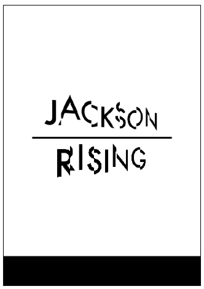
Title: Jackson Rising
Sub-Title: Curated by Jenny Dowd
Date: August 3, 2014 - August 31, 2014
Copy: Four artists met at an artist residency at the Ucross Foundation in 2013, now they come together to inhabit at MoMA, New York.
Location: MoMA, New York.
Contacts:
info@jacksonrising.com
www.jacksonrising.com
www.moma.org
Image: Jackson Rising ident / MoMA logo / NYU logo
Use of two colours only: Black and white
(Use embedded InDesign file and follow grid.)Save as PDF file.
Background:
This simple layout will ask you to utilise a short amount of body copy, title, date, and location. The minimal amount of text allows for the simple use of single imagery and the type to serve as the main visual elements.
Brief:
You are asked to produce a simplistic flyer design for Jackson Rising Exhibition at MoMA (Museum of Modern Art – New York) using the instructions below.
Specifications:
Format: A5 – Portrait
Title: Jackson Rising
Sub-Title: Curated by Jenny Dowd
Date: August 3, 2014 - August 31, 2014
Copy: Four artists met at an artist residency at the Ucross Foundation in 2013, now they come together to inhabit at MoMA, New York.
Location: MoMA, New York.
Contacts:
info@jacksonrising.com
www.jacksonrising.com
www.moma.org
Image: Jackson Rising ident / MoMA logo / NYU logo
Use of two colours only: Black and white
(Use embedded InDesign file and follow grid.)Save as PDF file.
THE TASK :
To begin the task i simply opened up the indesign doc with the grid already set up to begin designing and droping in the content.
To begin the task i simply opened up the indesign doc with the grid already set up to begin designing and droping in the content.
TASK 2
This text/image heavy layout will ask you to utilise body copy, title, date, and location, heading, sub heading, imagery, indexes, highlighted quotes. The amount of text allows for the use of imagery and the type to serve as the main visual elements. Brief:
You are to layout and design a 10-page concertina folded brochure for a forth-coming exhibition titled ‘Jackson Rising’ at MoMA, New York. All images, copy and branding are included. You have to create a visually stimulating layout that showcases the artists’ imagery but does not sacrifice important information in this process. The images and information must flow harmoniously and offer a taste of what is to be expected during the exhibition. Branding elements must be kept to black and white. Images must be unaltered and in colour.
Considerations:
Headings, headlines, body copy, grid, type, colour, image sizing, bleed, margins, flow, audience, narrative, language, purpose, size, external print methods, preparing for print, stock, distribution. Specifications:
Format: A5 x10 – Portrait – Concertina spread (front and back).
Title: Jackson Rising - Curated by Jenny Dowd
Dates: August 3, 2014 - August 31, 2014
Location: 11 W 53rd St, New York, NY 10019, United States
CHECK WORD DOC FOR EXTRA INFO - INTRO , ARTISTS & CONTACTS.
Concertina:
Using a similar style for my poster i slightly altered it for the front cover of the concertina.

 I used Apercu for body copy throughout keeping the aesthetic minimal. I decided to make the artists name in a large sub header text vertically along the side of images.

 For some pages i kept the theme really simple by using only imagery.


 On the last page i put an image by Ruth Boerefijn and the contacts plus more info.


 Final:


I decided to produce a simplistic ticket for the exhibition using the same copy and branding as the concertina and flyer.
Ticket for the exhibition:


I really enjoyed this mini brief it helped me to experiment with layouts and having to work to a specific grid. I liked how we had to use the given collateral for the flyer and concertina it made it more challenging.
Concertina:
Using a similar style for my poster i slightly altered it for the front cover of the concertina.
I decided to produce a simplistic ticket for the exhibition using the same copy and branding as the concertina and flyer.
Ticket for the exhibition:
Other proposed collateral :
I really enjoyed this mini brief it helped me to experiment with layouts and having to work to a specific grid. I liked how we had to use the given collateral for the flyer and concertina it made it more challenging.
Subscribe to:
Posts (Atom)