Thursday 31 October 2013

Design for Web - Defining my Concept

DESIGN FOR WEB

The last design web session i had was really helpful i have changed my idea quite a lot since my first initial right up for my brief i have now decided to souly focus on album art and not use Leif Podjaksy at all in my website although i researched him for my summer brief i have decided to branch off..

My original brief -

'For my website i will create an innovative online resource for design students to know the history about Leif Podjaksy & Album art . I will create a website using imagery for links but making sure i create this in the best possible way i will do so by making it accessible and easy to use by a wider audience.
 I will take into consideration colour typography and the skills to create unusual navigation  I want my website to portrait simplistic style yet be engaging i will thoroughly go through the different methods of research to make sure my website has the most appropriate content and a high standard.'

WHAT HAVE I CHANGED FROM MY OLD BRIEF?

I have decided not to use Leif Podjasky in my website. Having these sessions has really helped narrow down my ideas and thought process. After having web sessions and web design sessions i have realised how IMPORTANT it is to have easy navigation on your website if someone can't find a link they will just leave the page they won't just sit there and keep searching. So i definitely will stick to creating a navigation that is easy to see and use. Accessibility is such a vital point of any website.  I still will keep a simplistic style for my website i feel although doing my website about album art will help portrait my design aesthetic more.


DEFINING - To define my web concept more i have began by making mind maps on my more focussed choices this is to secure my concept so i progress with my research. My first mind map is about the general concept which is album art and and although i made different branches off in previous mind maps i think some of my sub categories could work together.

I wanted to initially create a website about The Foals but after discussing with Phil perhaps it would be to focussed and this brief is meant not only to produce a working website but the concept is meant to reflect our design practice and how well we can take our audience in consideration. 

Ive thought about creating album art resource blog so i am deciding between different genres of music , a year of music or just souly design based album art that fits the following categories 

  • Photo manipulation album art
  • Typography based album art
  • Geometric design album art
DEFINING MY CONCEPT


After looking further into i have decided to make a archive of album art i want to include iconic design but only between a certain year and only for certain style of design.

The areas i want to look into are photo manipulation ,Typography design and Geometric patterns. I decided this would be the best option so i could put my own design into it rather just having  an online resource showcasing other peoples work.

CONCEPT - 
My concept for the album art brief is to create an archive about album art the website will consist of 4 different categories , photo manipulation album art , typography based album art & geometric shapes album artwork. the final category will be album artwork packaging. 

AUDIENCE - I want the audience to be to for all design students its going to be an online resource for research general interest and inspiration.

TYPEFACE- I want to use a unique typeface either something really simplistic and minimalist or something that stands out and maybe would fill the banner area as an image. It depends on the overall aesthetic i go with.

TONE OF VOICE- I want it to be really informative but useful and not to heavy on text but key points dates and the points you would need to know.

SPECIALITIES - I have seen a really nice website i would love to try a similar style where shapes have the links behind this would work really well for an album art archive.

We have a Interim peer review session crit so i created a small mood board to share with my group to explain my concept - 


Wednesday 30 October 2013

Creative Suite 2 - Photoshop

PHOTOSHOP


 Photoshop has modes you find them in image>mode


The gamut warning is a good strategy to work in in photoshop , recommend work flow that you work in RGB but when you use it in illustrator or indesign convert to CYMK.
We can see how the settings (in hue & saturation) have changed when the gamut setting is on on the image.
The swatch palette is similar to illustrator

 We pressed ALT and we removed all of the swatches.


We then created new swatch called swatch 1 and saved it.

We then reset them and they went back to default.

When chosing a colour if you are working in rgb it will take you to the nearsest cymk colour by clicking on the warning square.
SPOT COLOURS IN PHOTOSHOP

 we chose a pantone colour and created a stroke over the image.

If we work in this way only photoshop can work in one mode, we cant work this way in photoshop for spot colours.

The next image we used was this picture it was in RGB

The image was in greyscale we had a look at the mode options and changed it to duo tone.
This box appears for options
 Dunotone options -
When you select the duo tone option the two inks will be blended.

80 % new ink - adjusting the ink can make the original match
GREYSCALE IMAGE


Channels are always black and white images.

We picked a new pantone colour

We next shaded in the boat using the paint tool 

We tried some different strokes on the image and and if you change the opacity the  colour of the strokes will be lighter or darker.


The last thing we did was use some text in the center this is for spot varish 

You can change the solidity in the options on the spot channel options
When un clicking the eye option on the panel the word will appear in its own layer.

Web session 3 & Task 5

WEB SESSION 3

PART 1  - we were asked to list the information(content - initial research from previous session) you think you should be incorporated on the website you wish to design, although it will highlight similarities and gaps of knowledge.

FIRST MIND MAP

For my first mind map  i looked at album art work this is my main focus to go down.

For my sub categories i  looked at 
  • Famous album artwork
  • History
  • Peter Saville factory records
  • Leif Podjasky
I then thought of sub categories for these pages - 

  • Famous album artwork - why were these so iconic?
  • History - Rejected artwork , The first album artwork
  • Peter Saville Factory Records - Album Artwork , Imagery
  • Leif Podjasky - Album artwork , History


Problems i will face - 

  • Will this portray my design skills enough?
  • Will this be to broad?
  • Pages relevant to one an other?
SECOND MIND MAP


The next mind map i decided to branch off on was Art work Design - 

The pages i would have would have are :
  • About
  • General album artwork design
  • Typography album art 
  • Resources
  • Geometric based album art
  • Photo Manipulation
I then thought of sub categories for these pages - 

Resources - Graphic design album artwork , My own design


Problems i faced:
  • Is this idea going to be more appropriate?
  • Will this be more beneficial to my practice?


 PART 2 - The next section of the lesson we were asked  to draw out your websites homepage , based on the lists above.

This first design i come up with was to have a record player in the middle of the page and have images as links on the right hand side and maybe a large banner down one side of the page. 
I like the idea of having the record player in the middle and having the navigation surrounding it and been able to click on different pages from sound waves.

The only problem with this idea is that i don't think the page would be to accessible and I've learnt over the past few sessions how important accessibility is.

The second design i came up with is having the album art work feature in the middle of the page and the centre and having a large banner at the top with either text or an image there. The navigation bar will run through the middle underneath the banner.

I prefer the aesthetics of this website and the navigation bar is more accessible but I'm still unsure if this what i would want to be my final design so i will keep drawing up scamps and initial ideas to get the best possible outcome.

We lastly gave feedback to our peers -


This is the feedback i received was :- 
  • Simplistic/Minimalist layout will keep structure when looking at different styles which will be useful to the audience!
  • Text underneath image is also good idea incase of loading times
  • I like the idea of keeping the record on every page , keeps consistency throughout the site
  • Like the use of the album artwork images links.
  • Maybe think about buttons or some better separation for navigation if that is how you are going to have it.
- I will respond to his feedback by trying the suggested points and keeping what is succesful

I felt this session was useful because it really helped me to decide between which route i was going to take the album art concept down i will carry on developing my idea along side researching this is the best way to help create the most efficient body of research and development .

Tuesday 29 October 2013

Designing for Web Workshop 2

WEB WORKSHOP 2

At the beginning of the session we put our scamps out and we had a little crit where our class walked around the room leaving notes next to peoples work giving everyone feedback.

My feedback
  • I think number 3 looks very unique for a website yet it still easily navigated and clear . Awesome

  • 1 like the use of illusion within titles. Also like the 3 due to image links ect.

  • I think the third one is the best looking and makes most sense navigation wise - more the links at the bottom more left - consider grids

  • number 3 good concept very you with the geometric shapes it looks like an interesting website very clear.
  • Good playful theme - consider more of a grid

Navigation should always be consistent.


OPEN DREAMWEAVER

We created a group 'wire frame' for the group website.


Make sure your working from the user work. Click on index

You can write notes in codes it is public.
we next added a container this is to add things for the background and style of the website like the width and the height.
We next added the Div which is an ID 

We then closed the Div
The next part of the container we added was the background colour i chose green which was one of the 26 colours used for web

This is the preview 

The next thing we did was add the position top and left and used 0 which means its right at the top this gets rid of the white space above the green background
The next command changes the DIV so the left edge is half way across its positioned half way across

We next added margin left and half of the size of the page which is 512 

This makes this background right in the centre

This next section is to create left margin and to choose a colour

I chose to use the colour black and it appeared on the left hand side. 

MAKING THE LOGO

We created a new document in illustrator a web document. we made the measurements 200px by 200px
We next created a logo in this 200 x 200 space 
We had to make the logo transparent so that it would appear on the website without the white box around it.
When saving the logo we are told to never hide the extension or it wont work.  So we unticked the box
The next step we added the logo coding .. the last part of the coding we added background-image: and it automatically gave you the option to add an image were you select your logo.
When i first created it i had chosen my side bar colour to be black and obviously it wouldnt of been viewable.
I then decided to just have the colour the same as the main part of my website.  so i went back into the colour option and picked a new one.

We next created a roll over image we did this for our button. so went through the same process for creating the image we used for our logo.. We first made a document for web in illustrator with a paper size of 200px by 100px
I typed home using BEBAS typeface.
We then created the same word but slightly different so that when we hovered over the home icon it would change so people would be able to tell it was a icon this makes it more accessible.

We created both of these in different layers and saved them both separately labelling layer 1 & layer 2
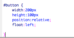
We created the coding so that the button would feature float left position of the website ( in the top corner).
We next moved the divs down using the enter key so its easier to find things when your looking through coding.
To insert the image we  insert>image objects>rollover image selected insert rollover image and browsed for our image.
We called it home button
We added alternative text so that when scrolling over the image it was easy to understand what it was for. Its also used for blind people because they have an auto reader on there computer which will speak.
My website with the home icon
The website with the icon when the mouse is on it.