Thursday 29 November 2012

Photoshop Workshop 29.11

Photoshop Workshop

This image was taken by a digital camera which captured the light. When printing the image it wouldn't keep the light as strong. You can change the colour image in image>mode>
You can change the image to CYMK instead of RGB this will show how the image will look when it is printed.


 Clicking on the Gamut Warning shows all the colours the CYMK cant.
Underneath the layers theres a button where you can create a new adjustment layer.
We tried using the brightness and contrast to get the original colours back but it was unsuccessful.
We found hue & saturation was more successful i moved the hue to the right at +149 , and moved the saturation down to -34 i left the Gamut warning on whilst doing this so i could see how the colour was changing.

Next Image
Creating adjustment layer
I made a new adjustment layer and clicked on levels. i move the middle arrow over to the left so the image would go brighter.
We selected in the layer mask where it says level. We clicked on the paint brush and made the fore ground colour black.We then changed the brush we were using to a soft smaller brush.
We repeated the same process with another image, its really easy to make a image lighter and use the layer to fill in darker places in the images with a brush.
For this next image the image been taken of the statue has to much light. The statue is dark and the image doesn't look very good. We selected the quick selection tool and we created an adjustment layer > levels.
We moved all the counters along the line to the left so they were all in the histogram. The image became immediately brighter and more detailed.
 
PhotoMerge
For the photo merge we clicked FILE>AUTOMATE>PHOTO MERGE We then selected 3 images from our file and clicked Auto and the ok.
 It took a few minutes to render then the image looked like this , all 3 images seamlessly put together.
Lastly we cropped the image so we got rid of the access grid from the outside.

Tuesday 27 November 2012

THE BIRTH OF A FONT Systematic OUGD404

Anatomy of Type - Systematic

In the session we stuck our different versions of the different typefaces at the most readable pt sizes and stuck them in a row on the wall. We found larger regular fonts easier to see from a distance and smaller regular fonts easier to see up close. Bold fonts were less readable than the others simply because the the spacing between the words is reduced, and the word reads as a block.

Script font grows apart if its to big. Your eye can't focus on one thing because the ascenders & defenders to big. you can use script for small body copy e.g wedding innovations. Words written in uppercase letters are less readable. They rarely have disenders . They are used. They are used for headline because our minds read the first and last letter.Gothic fonts are more appropriate for editorials, because there is a small text and more columns unlike a book.

Our task:- 
The Process - Use the individual anatomical elements of your chosen fonts (Gothic, Roman, Block, Script) to create a range of possible new letterforms.
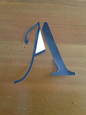
  •  Cut the individual ellements out and re-construct them in order to create a series of Hybrid leterforms.
  •  Select the 5 most succesful/interesting/legible letterforms and produce the uppercase and lowercase Aa, Bb, and Cc
  •  Trace these off and hand render them.
  •  Using the same approach to hybriding create the appropriate upper case Xx, Yy and Zz for each of the 5 new fonts.
I firstly directed all my letters so i could use them to move them around and create another font. 

Georgia & Gothic ....
Impact & Monotype...

Here is a photo book of my other images of dissected letterforms..

Using tracing paper and the two typefaces i will create the other 5 letters , b c x y z.
The first letter i picked from my photographs was-

Gothic -Georgia 


GEO-THIC12


Monotype - Georgia


GEOMONO-SCRIPT


Monotype - Impact


M-IMPACT1


Georgia - Impact


 GEOPACT


Gothic - Impact


THIC-PACT BOLD


What is research part 1 OUGD405

-What is Research PART 1.

  • Process is more important that outcome
  • Martin Veneky - “Graphic design doesn’t just straighten and clarify the world, it also reflects the world as it ventures beyond problem solving into process, experiment and discovery.”

FAIL        FAIL AGAIN        FAIL BETTER
  • Intuitive approach- What will work , fast approach
  • Stimulated approach- Seeking inspiration, going online , books , libary.
  • Systematic approach - Combing & extracting
  • A strategy for thinking through a problem.
Development
  • The accumulation and ordering of general information specifically related to the problem in hand.
Communication
  • An investigation of the nature of the problem, The investigation of possible solutions to people either inside or outside the design team. 
  • A strategy for visual thinking through a problem
Analysis 
  • What is the problem?
  • What do i need to know more about?
Research 
Evaluation
  • Which full fills the brief
  • Which looks the best.
Solution
  • Be prepare to go back to analysis/research
Research is finding out - how? why? what if?
  • Collecting , info , variety of sauces , books journals internet.
  • Research is the process of finding facts. These facts will  lead to knowledge research is done by using what is already known.
We will look at - 
  • Primary Research
  • Secondary Research
  • Quantitive Research
  • Qualitative Research

Thursday 22 November 2012

END OF MODULE SELF EVALUATION

END OF MODULE SELF EVALUATION

1. What skills have you developed through this module and how effectively do you think you have applied them?
I think I've developed a better understanding of illustrator, this helped me throughout the module, especially alphabet soup. I think i have developed a better understanding of type, type & colour. I think this helped the most with my message & delivery posters.

2.What approaches to/methods of design production have you developed and how have they informed your design development process?
I have approached a variety of skills & methods throughout this module. I think drawing final work before executing it digitally helped. Its not one of my strengths sketching ideas but for alphabet soup i defiantly helped.

3.What strengths can you identify in your work and how have/will you capitalise on these?
I think one of my main strengths would definitely be time management. I'd like to believe my blog is pretty much always up to date. I think if i left anything longer than two days to blog i worry about it. I think thats just my style of working and its proven beneficial at the end of the module.

4.What Weaknessess can you identify in your work and how will you address these in the future?
I think a big weakness of mine would be not producing enough developement work for briefs. I think i come up with a strong idea and stick to it i think this could be a downfall as i might miss a better concept to go with.

5.Identify five things that you will do differently next time and what do you expect to gain from doing these?
  • Feedback i receive for my work in crits i will definitely adjust them straight away i accept and appreciate criticism as it helps the final outcome to be as good as it can be.
  • I will use photoshop more than i do at the moment simply because I'm confident with illustrator and theres still room for improvement with my photoshop skills.
  • I will make sure i develop my ideas further throughout briefs just to make sure my ideas are in detail as possible.
  • I will make sure i label all my blog posts with the correct module code. I think i had missed a few from this module and had to go back through and label them.
  • Although i think my time management for blogging is really good, I think making sure i take lots of screen shots throughout development of work just to help show what I'm talking about.

Tuesday 20 November 2012

Type as Image-The Anatomy of type. OUGD404

Type as Image-The Anatomy of type.
Type
Type as image
Type & image

We looked at toilet signs - international , eg. in airports signs are recognisable from people of all laungageues so they can understand them.


  • Manipulating type & image
  • Anatomy of the type working with generating and developing type
  • Manipulation type to crete image
  • Type design essential logo branding identity.
In the studio session we brought in our cut out 10x10 letters A,B & C higher and lower case in the variations of fonts: Gothic , Block , Roman , Script.

We used one font and placed them underneath a strip of tracing paper.


We recreated the lower and higher case by different styles , eg. The letter higher case C we made as thin as possible and the lower case C we made as thick as possible. For the letter B(higher case) we increased the stem and made the bowl larger so the line was thinner and did the same for the lower case.

Tuesday 13 November 2012

SPECIFYING THE 5 TYPES


Specifying the font families.

In our studio session we looked at Type & Character, fonts and there typefaces and Legibility and Readability. We got set a task to help us understand further into font families.We had to use the five fonts we had originally picked from our university computers to analyse and specify.

The fonts i picked:-
Arial
Bauhaus
Century gothic
Neva std
Courier New

Using these five fonts i will do the following:-
  • specify each full fonts typeface family
  • pick the most readable typeface when presented a4 landscape
  • make a note of the pt.size and use 'Quick brown fox jumped over the lazy dog' because it uses all the letters in the alphabet.

Arial-
After trying each of the Arial typeface families for Arial std i came to the conclusion arial bold worked best at pt.size 80
Bauhaus-


 I found when researching the bauhaus font the typefaces were all similar apart from the thickness. I think that bauhaus 93 bold is the easiest to read.

Century gothic-

Neva std-


Courier new-


Impact- block font 

Monotype Corsiva- script
News Gothic MT-gothic 


Georgia-roman