Monday 29 October 2012

Print Workshop Vernon street

Print Workshop - Vernon Street
Our group had a print workshop at the Vernon street campus. We took part in 3 different workshops.
  • Lino printing
  • Letter press
  • Mono printing


Lino Printing
 For the lino print workshop we used one of the letters we create for a previous studio brief. My letter represented  the word boom. I chose to do the letter V because i thought it would take an interesting lino print. I first used green chalk and pressed my letter onto a piece of lino to create a print. I then went over the trace in pencil , then in pen to make it easier to see.


 With lino what ever you cut out it will print the opposite , so i cut out the inside of the letter V , using a lino cutter . Cutting away and up pressing against a wooden block incase i was to slip.
I finally covered the lino in black ink back and forth a few times to make sure it was fully covered and placed it on to the centre of an A3 piece of paper i then put another piece of paper on top , a cloth and then i rolled it under the mechanical press and pushed down the large metal square to get my print. I repeated this process with the same lino to achieve a faded edition of my letter.

Letter press


For the letter press we could choose any word we wanted just so we could have a go of using wood block letters , We had to large boxes full of wooden letters and there was also a large wooden cabinet full of other size and shaped letters. I picked a selected of random letters and inked them up the same way as the lino. Once i printed them i found it didn't really look very good with a different letter R . So i picked similar letters and repeated the process.
If to much ink is applied to the letters it creates bubbles and they print on to the paper and  this makes some of the letters distorted.When finishing with the wooden blocks we used old rags and oil to wipe off the ink and then dry tissue paper and a soapy water spray. This resolves any ink been left on them for the next people to use them.

Mono Printing


Before creating my mono print i drew a shape onto some white card using a ruler and pencil and cut it out using a craft knife. I had to use card as i was about to put ink on to it and paper would of rolled up and not been strong enough to hold a lot of ink.
I used the same machine as when i did lino print , after inking my triangle with a roller , i placed it on to the paper , then put another piece of paper on top , a cloth and then i rolled it under the mechanical press and pushed down the large metal square to get my print. I repeated the process with another cut out shape of a triangle to get lots of different variations. Mono printing was my favourite. 

Thursday 25 October 2012

typeface for the word BOOM OUGD403

Alphabet Soup - Creating the type face


For our brief alphabet soup , we had to choose one of our letters from the 10 we created and make a typeface. I chose the letter V i had created from my set. My word was boom my idea behind this was to create the letters to look as though they were all broken and it was what was left after an explosion. I began recreating the letters...
I began by using the letter V and using the pencil tool to create wave lengths across it. I then changed the stroke to create thickness it looked slightly similar to the letter i have scanned in but not as distorted and broken up as i wanted. 

 I Began using the pen tool to create similar like shapes from the letter V. I created a square and placed these shapes in. This is for when i come to create the other letters in the alphabet i can place a blank letter on top. 
I started duplicating some shapes i had created to fill in the square as much as possible and changed the colour of the shapes to black fill.


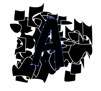
I created the letter A in a text box i selected it and right clicked and created outlines this makes it a shape! I then placed it on top of the black shapes i created with the pen tool.


OBJECT > CLIPPING MASK > MAKE 

Making sure the blank letter and the shapes in the back ground are all selected!


I repeated the process with each letter in the alphabet so i achieved this broken up letter. I did a version without a stroke..

I edited the type and put a stroke of 1pt on i found this works a lot better than the above, and looks a lot bolder. 


I enjoyed creating this type.Before last weeks illustrator workshop i wasn't very confident using the pen tool but after practising i managed to successfully make some shapes that looked like the pattern i had previously hand drawn for my letter. Although this type isn't exactly like my letter it has the same affect and i am pleased how it turned out. I tried placing the letters over different sections of the square i had made so each letter wasn't the same. If i was to do this again i would make sure i had left a little bit more negative space so the letters weren't as black.


Further Development & Final Typeface.

I liked the typeface i had done but felt that it wasn't enough for the final outcome. I think the reason was because it didn't take very long to do as once i had created the individual shapes it was just a case of making clipping masks  using the letters.Although my original letter i am using to re-create a typeface from is simple i still felt the typeface i had created was really plain.

I decided to change the typeface:-
  

I found this typeface on a font website , its called ' Boom Tank' I wanted the outsides of my letters to be ruff and not straight. I next thought i would try and add more shapes to the original square of shapes i had made to make the clipping masks from. Just to make it a bit more complex.

I began by taking the strokes off the shapes so they were just black shapes instead. I then duplicated some of the shapes.
I tested a letter on the shapes and felt it appropriate to keep some shapes with fill on.

I began putting them on to a document repeating the same process.

When finishing my typeface i added in a few glyphs so that there would be 4 characters on each line. I changed the type to blue.
Although i thought the type looked really good in blue i felt it was in appropriate for the word 'boom' and i felt yellow would work better to incorporate explosion . After testing the yellow it didn't work very well and the white strokes on the shapes inside the letters stood out a lot more in black.

My finished type face-


Monday 22 October 2012

weekend task typeface logo in context OUGD403


Typeface for product


For the weekend we were asked to place our typeface as a font for an existing product i chose to do Roc-A-Fella Records. This record label was founded by Shawn ' jay-z' Carter .I think my type face really works with the title of Roc-A-Fella because of the large record disc that makes up the letter 'o' in my type. I am pleased that the original logo is monochrome because  i find my type works the best in black. I decided not having the microphone wire throughout out the letters just for this because i didn't want it to be over the top i wanted it to simple. I also found the microphone wire didn't look very good with the first word as it is split up.
We went around the class looking at everyones logos and type faces together to see if peoples worked and just to get a chance to see what everybody had done.After then stuck all of our logos on the wall as a big group. 


Thursday 18 October 2012

ILLUSTRATOR workshop OUGD403 18/10


Illustrator workshop


In our second illustrator workshop we first started by opening up our previous work from the last lesson. We open the letter G we had created and started off by using the width tool this made it easier to changed the thickness and stroke of the letter automatically and adjust it to the size we wanted.

We next experimented with just a simple line tool and adjusting the line with the tool making a sting ray like shape. 


Our next experiment was to create a squiggly line using the pen tool and duplicate it to try different formats and uniform for each stroke. You were able to change the stroke uniform and ball point. There were different styles of uniform like jagged at dotted lines. You could also apply these changes to a shape outline there really easy to use.


There was also another option to edit our lines further , when clicking on the stroke option it was also easy to select different options such as dashed line and change the cap of the nib of the pen. 


We chose a few letters and we used the width tool to change end experiment with the letters.


The last thing we did when we were experimenting was used the blend tool. We created one shape then another and selected them both we then clicked the blend option. This created the long path making the shapes different from one and other makes a more interesting path.


Thursday 11 October 2012

ILLUSTRATOR alphabet soup OUGD403


Illustrator tutorial


For our alphabet soup module we have illustrator software workshops to learn different techniques and skills to help us produce our studio briefs. Also learning skills that we will use in the future and for other work.


We first did a work shop on pen tool exercises. I would say i am quite confident on illustrator but i haven't really used the pen tool that much so it was a good exercise to refresh my skills. We had to follow the steps and drag the cursor to the right parts of the shape. It took me a few goes on each shape until i got it right , and even though you follow steps to make the shape up i still found it a bit difficult. 

The next part of the workshop we traced over a letter 'G' that simon had created for us. We placed the tool into illustrator and make sure we had 2 layers. On the layer options we selected all the boxes on the base image and named it 'raster image' we dimmed the image by 50% and then lastly locked the layer. For the vector image we left it unlocked as that was the image we were working on to make the trace of the letter 'G'.


We went around the outside and inside of the image with the pen tool dragging and clicking to make the outlines of the letter. I found it quite difficult to make the lines match the original letter perfectly. once we had finished the outline we hid the background image so we were just left with the outline of the 'G'.

After we had our completed 'G' we used the white arrow tool and adjusted  our anchor points to get the a more accurate line trace. I think the anchors are so helpful because you can always adjust it if its not the right scale.
                          

We next created another letter 'G' using shapes we used the eclipse tool and placed them on top of each other using our previous 'G' as a guide. Once we were happy we selected all shapes and chose the unite tool which connects all the circles together.


We needed to make the gap in the ear of the letter 'G' , We selected the line where we wanted to delete it and double clicked until a small line of red dots appeared then we deleted the line. We joined up the gap using the pen tool. For the Circles in the top and bottom the 'G' we used the eclipse tool again.


When we were in the illustrator workshop , towards the end we got shown some examples of line drawing with a pen tool , and an image of the characteristics of a typeface. I found the characteristics image really helpful its easier creating a letter when you know its distinguishing features.


Tuesday 9 October 2012

Alphabet Soup partner TYPEFACE OUGD403 What i did


My first idea:-
When i first chose the type i was going to do i was also contemplating another typeface so it would look although the whole type was a wire but i didn't wanted it to represent music more and the feel for digital letters.I really did love this idea but i felt like i maybe would be able to explain enough the reason behind just a wire. Where as theres a lot of aspects to the font i actually chose.


The type i chose:-

The type i chose for my font is called 'square display' by vicar kumar i found it on a website called dafont.com. I found this type appropriate to re-create as i thought it looked very digital like anaglog. The main theme behind my typeface is music and i wanted to incorporate that as much as possible. After our mini crit with Amber and Simon i knew i also wanted to make the typeface lowercase as it would be easier for the wire to link to each letter.


When i was asking Jake stuff about personal interests for this alphabet soup project he told me how he was interested in architecture i think this font resembles architecture with the skinny design its also quite geometric and its aesthetically pleasing.


Experimentation and Development / How i did it :-

I next printed out a few letters of the alphabet on a4 and then two full types on a4 and i drew on them to try and find the best idea. I always knew from the beginning i wanted to create i really music based type and i thought doing a microphone or headphone wire running through the letters would work.


Record disc:-


I wanted to make the letter o to a record disc I didn't want to have every letter with a hole in like that as it would look to much. so I just stuck with the letter O.


I created a large black circle holding down shift at the same time as dragging the mouse so it would be the same circumference all the way round. i then repeated this making a smaller circle but a white one and i placed it in the center. i then made a smaller circle with a black stroke and put that directly in the center to create a record disk.


Glyphs:-


The type i found off the dafont.com didn't actually have any glyphs created so i had to create them my self using the line tool. I used the square tool to create the '&' sign. I wanted to make all the glyphs as similar as possible to the type so i played about with the stroke tool to make sure they were the same width.


Microphone:-


Creating the microphone was easy i used geometric shapes to put it together i used a isosceles triangle a large circle for the head of the microphone i put a white outline around the circle so you could see the top of it over the black cone shape. Lastly i used the rounded rectangle tool for the rubber parts on the bottom of the microphone this was to make it a little easier for me to join the microphone wire up to. I had originally thought of doing head phones instead of the microphone but i found the quality of it out of the shapes i had made looked poor compared to the microphone.


I removed the 'o' from the type and added in the record disc i had created. Then added the glyphs in. I next started by adding in a squiggly line from letter to letter. Although i found this to be easy at first it became quite teedias as i had to be careful i was repeating the same pattern or it wouldn't look like a crazy microphone wire.


Once i had got to this stage i was really pleased , i then started adding the wire to the glyphs it was harder than adding it to letters as some of the glyphs weren't very big. After i added them i dragged on the microphone i created to the right hand side. I found it quite difficult to match the wire up to the ends of the letters as i couldn't really get the width to match so that was somthing i had to be careful with when i was tracing it.


Final product with trace:-

To trace this type we had to present it on a1 tracing paper. I got the document printed out on a1 card and i used white tack to hold down the tracing paper. I went over the outline of every thing on the type , the letters the shapes and the wire line. It took a long time to go over it in pencil. 


When i finished the pencil i was going just going to go over the letters in black fine liner but found it would look a lot better if i coloured it in with black ink. It was very tedious after a while but I am pleased with the outcome. I think i found it the hardest colouring in the actual record shape that i used to replace the letter 'o'.


The badge:-


For the badge i kept it monochrome as i felt it would look better than in colour. I decided to go with the idea of the record disc and put Jakes name inside of it. It was quite difficult trying to bend a name round the shape of the circle.


I used the fish eye tool to make the letters of Jakes name bend round the record disc i selected the preview tool so i could see how much it was bending before selecting okay. I then used re-did the wire from each letter to letter and added on the microphone.


 I printed the badge on to some card a few different sizes to see what it could turn out like and then stuck it to a badge. Although i didn't stick to the guidelines for the badge i am pleased with how it turned out, and i think the type definitely works best in black and white.