Friday 27 December 2013

Lets sign together - Boards/Evaluation

SUBMISSION BOARDS - LETS SIGN TOGETHER


Client Feedback-


EVALUATION

When i was contacted by a by Susan Eastwood to do some branding for her business i was slightly worried as i began researching into existing sign language companies i wasn't inspired by anything as it was all very playful and not very aesthetically pleasing. Luckily the client knew what she wanted and giving me the variables and mandatories Eg. the colour choices and that she wanted something very minimal designing it began easier. 

It helped me execute the brief by first coming up with a name then straight onto designing the logo.Once the logo was finalised it became easier to take the branding further by using the information given and designing around that. I found it easy to develop the logo once i had designed the the hands making the heart shape. I found that style of minimal design only needed simple type placed around it to make it a strong enough logo.


I really enjoyed designing the logo and the business cards and once i had mocked them up on existing business cards i could see how the design looked and i was really pleased. I use monochrome a lot and the fact the client wanted to use the colour teal as the third colour made it more straight forward for me.


The biggest problem i faced was trying to think of a way to incorporate sign language into an actual logo but i think it executed well in a simple and efficient way. Until i had put the text round the hand shape in a rounded path i couldn't see the logo working but with a bit of persistence and development it came out how i wanted.

I think i found it hard to do this brief at first as I've never designed anything for this specific style of business before but I'm really glad i managed to design something informative yet professional and aesthetically pleasing in a short space of time.

My favourite part of this brief was actually receiving my client feedback and hearing how happy Susan Eastwood was with my work it made me realise how well i am progressing from first year as i feel i would never of been able to do this type of brief a year ago. I would love to do a similar brief to this again that is challenging but rewarding.

Thursday 26 December 2013

Responsive - Lets sign together - Design

BRITISH SIGN LANGUAGE BRIEF

NAME - 

To come up with the name i made a brain storm and developed the name until i come up with the best one.


I came up with 'Lets sign together' i felt this was the most appropriate name its friendly and simple i double checked with Susan before carrying on designing if she was happy with the name and she loved it.

LOGO -

I decided to make a circular shape as this always helps with a logo as its rounded it can be used across platforms e.g. stickers ect. I made the logo with a circular shape first i then drew to hands to combine and make a love heart shape. I firstly drew one hand i then used the transform tool and flipped it 90 degrees.

Variations

I began showing Susan some variations she said she liked them but i should include ' British Sign Language at the bottom this would help people understand slightly better and quicker what the company was.


I next used the type around a path tool and put text of the name of the logo 'Lets sign together' around the top of the logo and ' British Sign Language' around the bottom.


After the logo was finalised i began looking at colour choices she only want the maximum of three colours when i first spoke to her she told me she was keen on the colour teal so i decided to test it out and it worked really well as a set.


Inverted white -
 Logo teal background -

Business card variations-


I Felt this was the best variation i went back to the original logo -  simplest form , the text worked well around the logo and centred on the business card.

Back of business card-


FLYER -

For the flyer the client wanted me to put in a long portrait flyer slightly longer than a half an A4 and she emailed me the information to go on it i chose to place the logo at the top and also her email and phone number at the bottom also the same for the back.


 LOGO FACEBOOK BANNER -

I was asked to make a Facebook banner in high resolution which just the logo on.


FACEBOOK BANNERS-

After sending the client all the current work i then spoke to her and she sent me some more information asking i i would create some more images for Facebook she could use putting just general advertising.

I used a structure of splitting up the text with a simple white line and having her contact details on there to aswel as a the logo with no text around.


PRICE LIST & EXTRA INFORMATION-

When asking me to a price list i simply used the information given to me and the same template as previous using a white line to break up the text. Keeping it simple and minimal.


I am really pleased with work i have done in such a small space of time this turn around brief was enjoyable and i would love to work for this client again. The feedback i received made me feel more confident with working on live client briefs.

MOCKUPS -


Monday 23 December 2013

Studio Brief 3 - Boards

 DESIGN BOARDS


Studio Brief 3 - Designing & Production

DESIGN & PRODUCTION.

LOGO DESIGN:

I first began with this logo i had made a lot of sketches and thumbnails so it was just a case of getting them into illustrator so i could see what they looked like.

These A's are to represent Apex and a tapas stand.

I tried Mexican colours:

Although i felt they were a little pale and i didn't feel although they were working that well.


FURTHER DESIGN BRANDING:

After some research i decided i would try and get a flower shape to represent day of the dead and try and tie that in with my design to see what it looked like.

I went on youtube to find a tutorial to achieve the flower pattern that i wanted.


I tired different variations-

I prefer this one the most:
I began playing about with my restaurant name and putting flowers with the text.
The most obvious infographic i wanted to achieve was this skull so i put a flower in the eye instead of just a dot so i could achieve both of things i wanted in one vector.
Different variations:


Possible menu branding:


I added a bar in my letter A to create the tapas stand.


Through my research i found this Mexican image on designspriation and a felt it would be appropriate to mock up my logo inside of that as i was doing a Mexican restaurant that i would need a house shape with a point to really strengthen my concept of apex to go with the restaurant aesthetics.

I tired a different stroke to see what feel i would get.

I preferd the straight line i felt it was more geometric and was more appropriate for my design.


Variations:

I tried my letter in the yellow and i don't feel it works.
I like this variation but i think it could possibly be to dark. I used haymaker typeface which i had picked because of the mexican feel the typeface has with the points in the letters remind me of old western.
I came to this variation after deciding to just go with the black red and green I'm really pleased with this variation and will use this as my logo.
MENU 1

I applied Haymaker typeface to my first menu which consisted of cocktails and wines. I wanted to split my content up so i put a black line through in the center.


Next to keep with my colour scheme i added some green dots under the line this also adds to my sugar skull theme.

I added my logo into the top corner of the menu.


After finessing my menu i decided it might be more beneficial to my concept (apex - highest point) to try using triangles instead of circles. I then tried them up side down and in alternate order so some were up and some were down.
Final logo:
I changed the dots on my branding to triangles aswel:


Menu 2

Menu 2 had a similar style using the black line again to chop the top section from the bottom, This menu was souly for tequila.

I kept the same aesthetics by putting the green triangle line with the black line.
I finally added a skull to this menu this helped remove some of the negative space.
 Menu 3

Menu 3 is my tapas menu . This menu adds to my concept about day of the dead as the food i serve at my restaurant is food they serve at day of the dead offering.


I added skulls again to represent the hotness of the food.
Using the same dividers i split my menu up making sure i added in my logo and the hotness skulls signifiers.
Menu 4

For the last menu i added in more food than the other one because this menu features snacks and dips also sides.
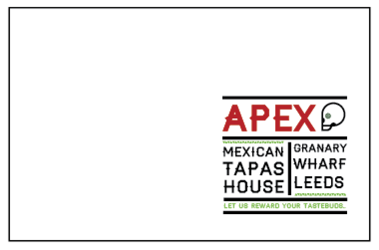

 Poster:

For my poster i added my branding and changed the location from trinity to granary wharf. I didn't want my restaurant to be to commercial.


Poster:

Coaster:

I didn't want to create a table mat because not many restaurants I've recently been to have table mats anymore so i decided i would make a coaster that would be used at the bar. Which is simply my logo.

Pattern Design:

I wanted to make food wrapping so i decided to make a repeat pattern using one of the first flowers i had designed the same flower used from the skull and the skull i didn't want to over crowd the pattern with to many shapes.

I made the pattern on illustrator:

New Pattern - grid


Flags:

I decided to make small flags putting the hotness of the food on them, i printed a few different sizes and made prototypes before i printed my final piece.

Business & Loyalty Cards:

I shared out two pages of 8 to use for my business cards & loyalty cards.


Business card:

Front:

Back:
Loyalty card:

Front:
Back:
I printed these two double sided.


The last thing i printed was a sheet of stickers with my letter A on for my accessories i am really pleased with my designs and i will print onto antique white to achieve a western look.