Showing posts with label Design for web. Show all posts

Wednesday, 15 January 2014

Evaluation - OUGD504

EVALUATION

What skills have you developed through this module and how effectively do you think you have applied them?

I have definitely developed I wide range and understanding of different print processes. Being able to recognise what works and what doesn’t. OUGD504 has been more of a creative challenge for me as I have tried lots of different methods that have been unsuccessful as well as successful this has helped to develop my skills further to make the right design decisions. I think I applied my skills well definitely towards the end of print, once I had tried all these specific processes. I have also developed skills in Dreamweaver being able to try different methods of code to achieve the layouts and styling I needed. Further more in studio brief 3 I developed skills of distribution being able to apply my designs across many platforms.


 What approaches to/methods of design production have you developed and how have they informed your design development process?

In print methods I used for my work were laser cut, foiling and using vinyl. I think using the laser cutter has definitely informed my design development process a lot because I tried so many different methods and I really enjoyed using the machine. In practicing these processes I found the best possible methods and outcomes for my test pieces and my final pieces.

What strengths can you identify in your work and how have/will you capitalise on these?

I think I strength of mine would be concept for this module I feel as though for all 3 briefs I had a strong concept which was led from a lot of brainstorming and initial sketches and ideas. Through these thought processes I didn’t stop at one idea I kept branching.
I also feel that I took on a lot of creative challenges and didn’t put them as side when I felt they wouldn’t work I stuck with them and I am really happy with my final pieces. I will defiantly continue in further briefs to branch out with initial ideas because that’s where the best concepts come from.

What weaknesses can you identify in your work and how will you address these in the future?

A weakness of mine throughout this module would be doubting some of my work until I had actually finished some of the pieces I was unsure if they were going to be sufficient enough or look exactly how I wanted them to. It’s not ideal to doubt your work because it left me feeling negative. To change this in the next module I will create a lot of mock-ups and prototype this will help me visualize the final pieces and give me more of a variation to my work.


Identify five things that you will do differently next time and what do you expect to gain from doing these?


  • Plan a little better so my time is used evenly between briefs. I expect better outcomes and to be less stressed.
  • Not doubt my work as much because it has an effect on my performance. Feel more comfortable with my design work and be happier with my outcomes.
  • Try more processes – I expect to have a high level of work and bigger variation of work.
  • Make sure I will do even more thumbnails and sketches than I have now. I expect this so show my full thought process so my concepts are accurate.
  • Try my work across more platforms and try different layouts to make my designs be responsive for all devices.


Tuesday, 14 January 2014

Helpful Shortcuts i have learnt - OUGD504

SHORTCUTS

Throughout this module i have found lots of different tools that have helped me a lot when designing and when doing my work here are some of the most beneficial ...
  • CSS sprite
I used this specific code to help me make my roll over images one. image instead of two i found a realy helpful website that talked you through it step by step.

a.imagesprite {
display: block;
width: 125px;
height: 60px;
background: url(location-of-your-image.jpg) no-repeat 0 0;
overflow: hidden;
text-indent: -15000px;
font-size: 0px;
line-height: 0px;
}

a:hover.imagesprite {
background-position: 0 -60px;
}

a:active.imagesprite {
background-position: 0 -120px;
}
  • Vinyl sticker
Learning how to use a vinyl stickers has been extremely helpful not so much how to actually make them but how to stick them down neatly and in a straight line. I did this by cutting a section of vinyl and sticking masking tape over i then peeled off the access and rubbed the masking tape where i wanted it and when peeling the masking tape off my vinyl was then in a straight line all equally spaced its a really affective way and will definitely use it in the future.

  • Laser cutter - re cut
When using the laser cutter i found a way then when i wanted to repeat the same action i had done i could press enter under material twice and press recut to get the exact same job twice in a row. This was really affective when i was engraving some wood and needed the engrave to be deeper, You can repeat this process till you get the look you need to achieve.

  • Illustrator - paste in place
I think i have learnt to make my work more accurate over this module and knowing when i have something on one document and want to have it on the same place on a similar document i just have to click on the document and go to edit>paste in place this makes sure everything is equal and all my documents are the same its good to keep a consistency it makes your work produced at a higher standard.


  • Photoshop I - eye drop tool & G fill colours.
When i was using photoshop to create my roll over images some of the images were smaller than i required so i filled in the top space and the bottom space with the same colour as the background image. I pressed 'I' to get the eye drop tool selected the colour i needed i then pressed g which filled colour into the spaces i need this was really affective and quick and you couldn't tell that the image was smaller to begin with because the outside colour was exactly the same as the background.

Friday, 10 January 2014

Design for Web - Evaluation

DESIGN FOR WEB EVALUATION

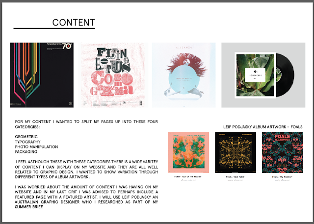
For design for web my concept was to create an album artwork website that featured different genres of album art such as geometric , photo manipulation , packaging and typographic album artwork. Based on my summer project one of my research categories was album art and i found this the most interesting so decided to go with that. My main focus for my summer brief was Leif Podjasky an Australian graphic designer , i was advised to perhaps have a featured page on my website including a artist every month i decided for my website to use Leif Podjasky as i already had all the relevant content and information.

I am really pleased with how my website turned out i found it very difficult to code at the beginning but once i had some practice and made sure i typed code into the relevant places it came together. I was worried at first i didn't have enough content as on each page only has 12 images in total but because I'm doing an album artwork website i was advised in crits that i didn't need anything else. I chose most of my images for my website off designspiration there was a good variety on there. I found especially difficult to find the artists who designed the artwork so it was a little harder getting the content than i thought.

I found coding a website the hardest brief out of all 3 It was more the fact that if i placed something in the wrong container it simply wasn't working. Before i made wireframes and was playing about on dreamweaver i found it difficult to actually make anything and style it. But once i had produced a wireframe/scamps with exact measurements everything was a lot easier. Although i only have a website with a lot of images it took a lot longer than anticipated to design my website. I think a strength of mine throughout this brief would be coming up wireframes and being exact with my design also preparing images/content typefaces and colours before beginning so everything was ready. A weakness of mine would be being impatient and getting annoyed when something didn't work i find coding really tedious and i much rather the design side rather than coding.

I looked at youtube videos and websites to help me throughout this brief I'm impressed with my self that i used a css sprite to upload images the reason i did this was because i had 36 images to upload and to have them all roll over images would of took me a long time so using a sprite helped me cut my photo upload in half this did save me a lot of time.Although i didn't thoroughly enjoy coding it has been and experience and I'm glad i got the chance to learn how to use dreamweaver I'm very pleased with my outcome. I would like the chance to design a different style website in the future i also think its important for me to keep using this programme so i learn more about it and get more comfortable with styling.


WEB : Final work


Tuesday, 10 December 2013

Final Web Crit

FINAL WEB CRIT

For my final web crit we placed our work and our design boards on to the table and left as the other group left us feedback about what we might improve about our website and what we can change.

My Questions were:
  • Do you think i have enough content?
  • Do my colours work? Is it to plain
  • What could i possibly add?
I received 6 pieces of feedback for my questions:


1
-Yes maybe add a description of the concept not the information roll over images but the clean layout really works for the site.
-No i don't think its too plain the site allows the album artwork to be featured so the minimal aesthetic is functional
-As said before some text explaining the concept of the album artwork could be really useful.

2
-Enlarge images?
-Looks very slick just needs more content
-Why is there a packaging section?
-Audience?

3
-Unless you plan on adding a lot more images then you may need to have a reason as to why this i narrowed down - some content/external links
-Neutral background works well with the images being more vibrant , navigation on home page is interesting.
-More contextual information on chosen albums why are they there?

4
-I think more information could be added about the album artwork such as a date/ a designer?
- The colours are well chosen as they are almost lost and therefore do not detract from the images themselves
-I think more experimentation could be done with the homepage.
-Have the design look like a record with the information on the label.
-More creative.
-I would like to be able to see the album artwork & The information at the same time.

5
-I think on the album geometric pages more info could be added as you do have space & at moment is not informative.
-I like the colour of background you need something plain to be able to have the artwork which will be in different colours well . I maybe make logo more detailed to head at the page.
- At the moment i am not to sure why the links packaging is there but thats probably do to me not understanding the audience is not clear although i am guessing its for music enthusiasts interested also in album covers.
- I think you could add info such as albums down the years maybe like how albums have progressed & changed throughout the singers career? Or maybe just more info about the albums. I would propose to show when you clock on it then it would link a page with albums info next to each other.

6
-I think if you are displaying an archive of album art work then it needs to be extensive but this could just be a proposed idea.
-I like the colours and logo and i think the background image works well as a texture
-To add i think you need some info about each of of the albums.

Main points i got back from the crit:
  • I needed to add more content
  • Explain the sections
  • Possibly have the info about the album next to it.
I think my website will have more content when its finished i could possibly add more information about each section i will consider that when i have finished coding.

Some of the feedback wasn't really relevant but I'm really pleased i got 6 pieces of feedback there was a variety of answers and some things were similar.

Tuesday, 3 December 2013

Production of website - Roll over images.

PRODUCTION OF WEBSITE 

ROLL OVER IMAGES.

This is my test of the css sprite working successfully I'm really pleased with this method its saved me a lot of time.

I saved my image on the top 50% of the image and typed the information about who designed underneath in arial bold.
save for web then saved the image as png
I saved it as g1. ( for geometric images) The route folder is already saved so the images will automatically appear on my website if saved in the right place.
Geometric pages:

I repeated this method for these images.


Always re-checking the index file by previewing it in chrome and refreshing the page.


My first page finished for geometric.

 I repeated the full process for this saving each one in order of numbers going up from 1-12 


I made sure i always had the blue ruler line across my image if some of the text from the bottom image or the image from the top bled into the other 50% you would be able to see as part of the other image in the roll over.


I always had to make sure i was always saving for web else it would save to my index properly.

Finished geometric pages.
Typographic:

Again for the next 12 images i repeated the same method as all of my first three pages featured 12 images.


I always needed to double check that they image uploaded properly as a few times i resaved over the previous image by accident.
Here are examples of the box being used to create all of my images individually.


Finished typographic:
Photographic:

I saved my typographic images the same way as the rest.

Making sure i changed the number each time that i saved it as.
Finished first 6 images fro photographic page.


Finished last 6 pictures on typographic:
Packaging :

Packaging was a little different they all saved in the same way but when i had the images in photoshop they weren't perfectly square so it was a case of editing the images before putting them into my roll over image ready for web.


These two images were square so they were simple enough to add on.

This particular image i needed to add a trip of the same colour to the top and the bottom to fill out the square i couldn't simple drag it because it the image itself would of bled.
did the same to this image aswel to make it bigger. It was simple because i used the i drop tool to get the exact same colour as the background and then the fill bucket tool to fill in the square selection i had created.
Finished first packed page:


Finished last packaging page.
Although this method still took a long time to upload all the images it was a lot quicker than uploading 64 individual images when i could create one image and split it.