THE FIVE FUNDAMENTALS
Saturday, 30 November 2013
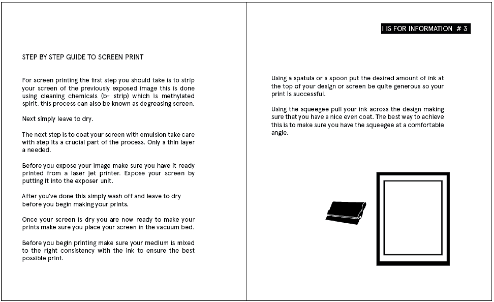
Packaging for Print Pack
PACKAGING FOR MY PRINT PACK.
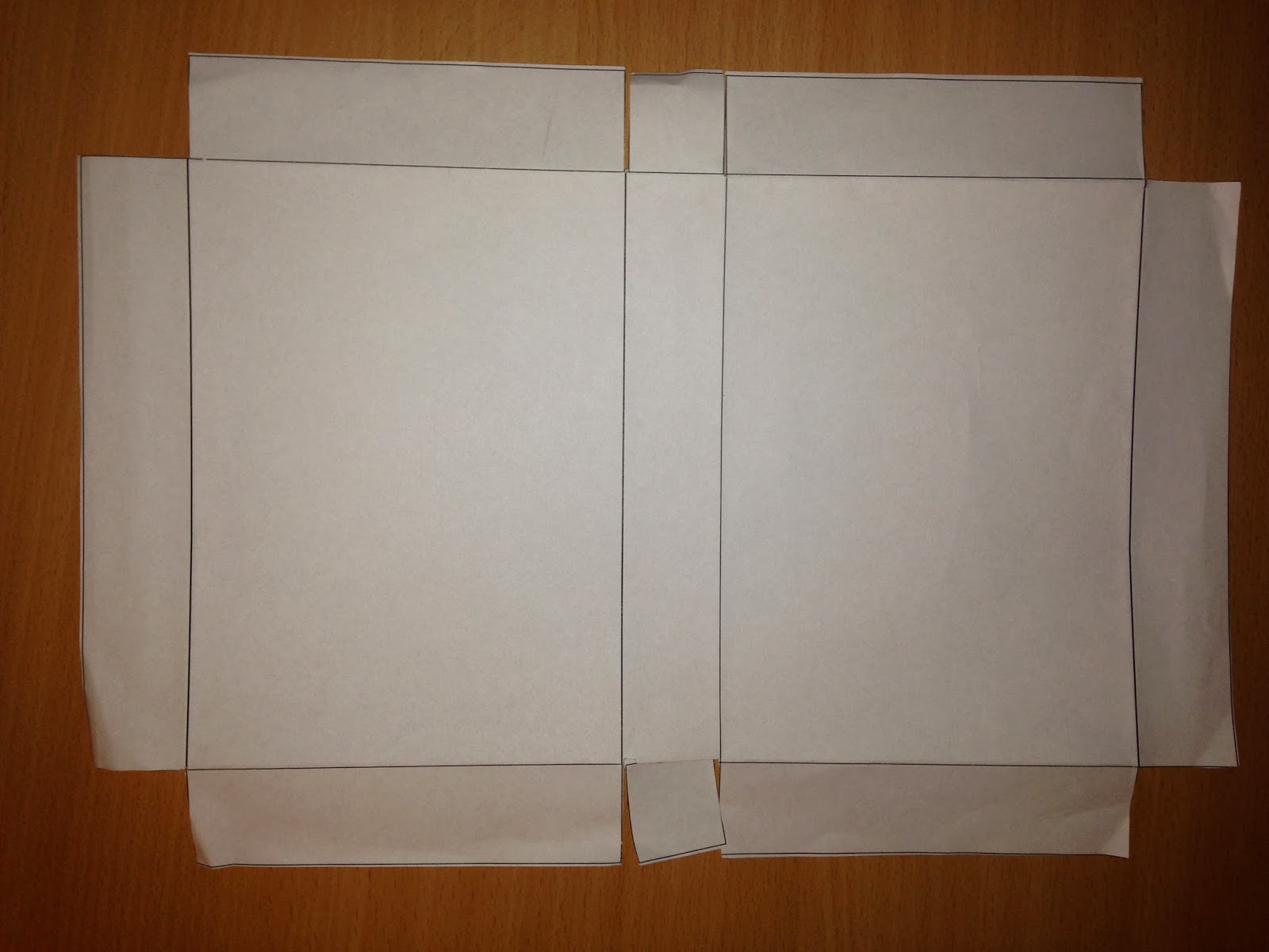
I decided i wanted to design a box for my publications to go into i really liked the idea of having a perforated pack so i decided to make a simple box the width and height of my box that i could create a perforated line accross it so it could be ripped open.

I designed tabs for the full way around the boxes so i would be able to seal it when i had assembled it.

I decided to use big noodle titling again so it kept the consistency with the rest of my my booklet titles.


I changed the leading on my text so that it will sit closer together. I felt it looked better i also added a block line underneath as i felt something was missing.
The next step was to create a perforated line. I decided to use one of brush patterns from the options.


I chose borders dashed line 1.1


Unfortunately the first net i made didn't work as i had expected the middle folds didn't work so i had to adjust the box.

I redesigned it so the middle had small square flaps i would be able to glue to the inside.


PROTOTYPE :-
I printed out my new net to see how it would look stuck together and my net worked fine.


I wanted to design some stickers for my print pack and for the front of my booklets so i designed them on illustrator and made them into outlines the same i way i would design something for laser cutting but i would create vinyl stickers for this specific design.

I printed them out first on a4 so i could messaure the sizes of the number were right.

This is the vinyl cutter cutting my design.


Perforated Pack-
For the pack i needed to cut out the perforated line i used the laser cutter on my design upwards with the design facing up because the outside of the box won't have any colouring on it. It will be plain with the vinyl sticker on it.

This is the perforated line just an inch down from the top.


When i tried again i decided to add a rasterd cut through my perorated line so that the lines that were broken already had a small engraving so they would tear easier.

Although this was a good idea and it did work it teared to quickly and when i went to score the box it would pop open the perforation instead of me being able to pull it.

I tested a few different ways on an old document before attempting it on a new one so i didn't ruin my work.

The most successful out of the mall was the same perforation but just made thicker so a large strip would rip this made it easier for the stock to pull rather than the old box that didn't have enough strength so it broke off.

Final inside for perforated box.

Designing The Belly Bands
BELLY BANDS
For my 5 small publications i knew i wanted to create belly bands for them. I chose to use fluorescent orange stock as part of my colour choices so i decided they would be the best colour for the belly bands also because there vibrant they'll give the publications a bit of variation and make them stand out.
My first initial idea was to have belly bands around envelopes but i soon realised there would be to much packaging so i decided to have a belly band around each publication and then create some kind of box to put them all into.


I definitely wanted to use the laser cutter for my publication belly bands so i would either cut the title of my book out through the belly band or a circle so you can possibly see the number

As i have designed the front of my booklets to have a number on them i knew my belly band needed to be a large strip with a circle cut out.


I mocked up several different sized belly bands and printed them out A3 so i could see how big they would look after been laser cut.


Unfortunately that wasn't an option as my stock was to large so i was suggested to go and cut out the the belly bands on the guillotine and use the laser cut to purely cut the circles out .
This would work well because the width of my circle fit into the width of one of the metal frames thats in the laser cutter.Removing the frame would stop the laser bouncing back up and making a mark on my stock.

To cut out my circle i had to press online on the machine and follow the process just like i had done previous for other experimentation but to recut it was really simple.

After pressing online i pressed enter twice and it gave me the option to recut. I just needed to make sure i put my stock in the same place every time.

I repeated this process 5 times to achieve all 5 of my belly bands.


Production of Print Booklets
PRODUCTION OF PRINT BOOKLETS
PAPER FORMAT
When i first created my booklet i began with an A5 document i only wanted a small publication that i could print my content into within the grids but when i first looked at the page size i realised i much preferred a square so it was something different and it would also work better with the belly bands.
Originally it was A5 i created a custom page for Width 14.8cm x Height 18cm.


BOOKLET #1
I added my title P is for Preparation and a short section of information about what this particular booklet is about.
I added my title P is for Preparation and a short section of information about what this particular booklet is about.


I put a list of print definitions on to the first page i really wanted to use columns throughout my booklet but some things such as a lists make better sense in a list so i placed the text on the page like this.


The third page i have written about four different sections throughout colour so columns are appropriate for this page. Im trying to keep the consistency throughout the pages.


I added the appropriate info graphic for grids.


My last page was about crops and bleeds


The same as booklet #1 i added the title on the page and added the information about that booklet.


Using the same grid as before i placed the text into the pages.


The last page i thought it would be a nice idea to add resourceful websites. These websites are important to someone who is just beginning because they inspire.


BOOKLET #3
Booklet 3 is a guide to 3 individual processes that i tried my self so i knew best how to explain them.
When i got to this stage of designing i realised that the anagram for print and these 5 booklets was easy to understand there for i didn't need to put i is for information in the title. So i went back and altered the other pages.


The numbers booklet is more about the technical side of printing and designing.


For paper sizes i didn't want to create multiple pages with different single info graphics of page sizes so i designed a generic paper size grid with no numbers on it.


I decided to touch on paper and stock weights as i think they're really important and you should know the different types for when your designing.


Points and picas are not vital information for designing for print but i felt it would be good to add them in and also try and keep the consistency in content throughout the books .


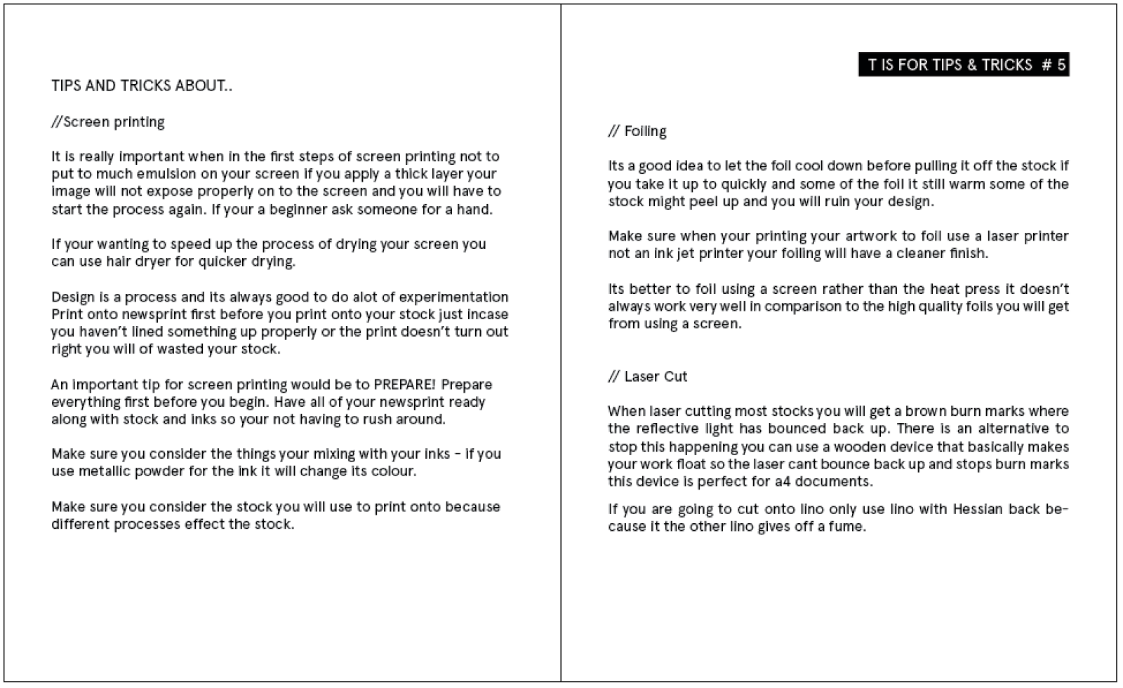
My final booklet is about tips and tricks. I thought this would be a nice chance to add tips and tricks i have learnt throughout the print processes i have tried and to add them in.


I started off by adding in tips and tricks about each of the three processes i had already spoken about so you could refer back to it and make sure you consider the points i made before executing any of these processes.


I placed more of the information on the left and the last section about laser cutting on the top right also adding a stop watch infographic .


My very last page of the booklets is about time management and tips on how to manage your time and how important it is. I added a small paragraph of text then added a calendar infographic.


Subscribe to:
Posts (Atom)