DESIGNING MY WEB PROPOSAL:
I first began by making 5 art boards for the pages on my website. I really wanted to create a landing page because i felt i had a strong logo.
It felt a little bear so i added in a large line underneath the logo and my green triangles i have used throughout my branding.
I created a navigation bar across the top with the page names.. Food , drinks , loyalty rewards & where will you find us?I then made a big square to put my content in an another nav bar down the right hand side.
I moved it because i didn't feel it look appropriate underneath the logo.
I created the content by using my already written menus and had all food in one section with the different categories down the left hand side.
Tapas , starters , sides & dips , big grub , sharing & snacks.
I still included my skulls for the hotness of the food. This is to keep the consistency with the restaurant.
I did the same for the drinks menu
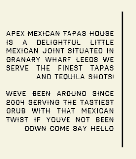
I decided to get rid of the loyalty card section as it wasn't very relevant for the website and replaced it with an about page. About page is much more informative and tells people about the company and who they are.
The other side of the text i will have an image of my proposed interior.
On the where will you find us page i included a screen shot of the map for granary warf so you can view where the restaurant is on the map.
I included the dress , telephone number and opening times.
Finals:
IPAD PROPOSAL :
I wanted to design a user friendly iPad/IPod app with the same aesthetics as my website.
I began by putting the navigation names under one and other on to my iPad mockup. highlighting in green which page you are on.
I copied onto my iPad mock up a scrolling bar just like the one on my website. i wasn't sure how people would pull down the small white bar so i decided to add something to it.
To keep the consistency of the website and app the same i decided to add in the small skull i had designed and some text saying drag the skull as you drag it the page will automatically scroll like your average iPod app or shopping page.
I repeated the same style for the second page i mocked up using the large logo in the middle at the top. I then added the tabs of the names for the individual pages highlighting the page you are on in green.
Im really happy with my website mockups and my iPad i think they follow a consistency and i will now apply my designs to mockup screens and iPads.


No comments:
Post a Comment