WEBSITE PROPOSAL - DEVELOPMENT & DESIGNS
GRID-
This is the grid i used
10x7
FIRST MOCKED UP PAGE-
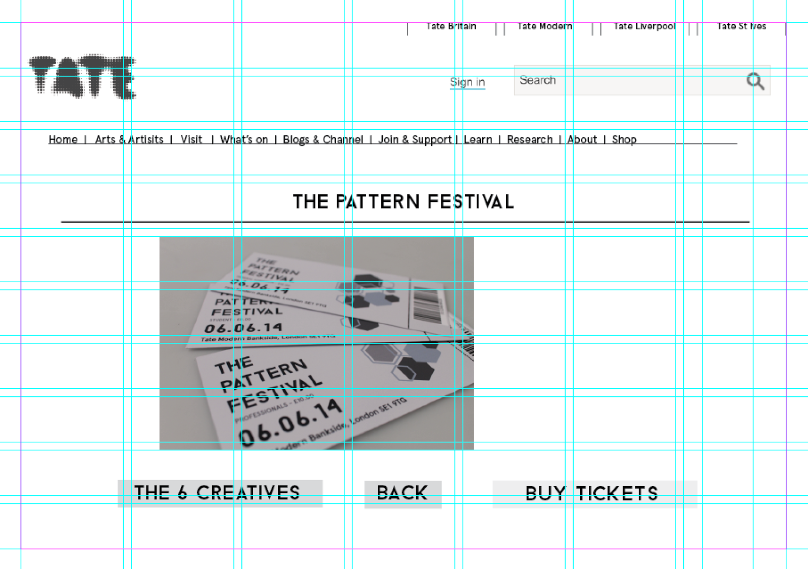
I used the tate website to mockup my webpage for the pattern festival as it was being featured in the Tate it made sense and as my pattern festival would possibly only be by annual it made sense.
Copying there layout and there content placement i added in my own images to the whats ons section.
Menu:
Calendar:
Whats on page - i added lines to break up the content from the image-
Using an image i took from the left hand side i added it in the mocked up web page.Finished page-
I lastly added in four small squares to demonstrate which page you were on.
SECOND PAGE-
I put the title centrally
Coming soon-
I added ' The 6 creatives & 'Buy tickets' to the page this would define which page you went to next.
I also added in some shapes to keep with the consistency of the pattern festival theme.
Finished page:
THIRD PAGE-
For this page i made sure the 6 creatives button was lighter although that was the page that had been clicked on.
Keeping with the aesthetics i added a hexagon for each of the artists names
I put the artists initials inside of the shape and there full name underneath -
Finished page :
FOURTH PAGE-
For the fourth page i made a page that you would be directed to after clicking on the specific artist.
Next to the information i added an example of the work they produce.
I lastly added the same buttons i added on the first page so you would be able to scroll through more images and artists work.
FINAL PAGE-
The last page i designed was for the tickets of the pattern festival to be bought.
I added in the buttons for , student , professional & General admission.
Final page-


No comments:
Post a Comment