PRODUCTION OF PRINT BOOKLETS
PAPER FORMAT
When i first created my booklet i began with an A5 document i only wanted a small publication that i could print my content into within the grids but when i first looked at the page size i realised i much preferred a square so it was something different and it would also work better with the belly bands.
Originally it was A5 i created a custom page for Width 14.8cm x Height 18cm.
When i adjusted the paper size i wanted to print it out to see how it would look and how the custom page changed from the original .When i tried to print the blank document it told me that it was because my page orientation wasn't he same. I spoke to mike in the mac suite office and he told me that this specific program is a flaw with in inDesign and its because I've changed the document after i had created it.
BOOKLET #1
I added my title P is for Preparation and a short section of information about what this particular booklet is about.
I decided adding a flash of colour underneath the titles to break it up a little as the page was only white stock with black text.
I felt adding a tab for the number of the booklet you were reading also broke the page up as i felt somthing was missing.
I use the same grid for all my pages.
I put a list of print definitions on to the first page i really wanted to use columns throughout my booklet but some things such as a lists make better sense in a list so i placed the text on the page like this.
The second page i have written about planning , thumbnails , lists and saving artwork so for the four different sections columns are appropriate for this page.
I added a check list info graphic onto the opposite page to go with the text.
The third page i have written about four different sections throughout colour so columns are appropriate for this page. Im trying to keep the consistency throughout the pages.
I added the appropriate colours for the CYMK colour mode & for RGB.
This section was about grids so again i used columns but for the second part of the text it was more of a list.
I added the appropriate info graphic for grids.
My last page was about crops and bleeds
I made sure the title on the page sat above the first grid line.
I really liked the aesthetic of the title being like this so i went back and added titles to the other pages.
BOOKLET #2
The same as booklet #1 i added the title on the page and added the information about that booklet.
This book is a simple guide to the resources at the university you have what available process you can do , digital printing & library stock.
Using the same grid as before i placed the text into the pages.
Lists again in columns for the material section.
The last page i thought it would be a nice idea to add resourceful websites. These websites are important to someone who is just beginning because they inspire.
BOOKLET #3
Booklet 3 is a guide to 3 individual processes that i tried my self so i knew best how to explain them.
When i got to this stage of designing i realised that the anagram for print and these 5 booklets was easy to understand there for i didn't need to put i is for information in the title. So i went back and altered the other pages.
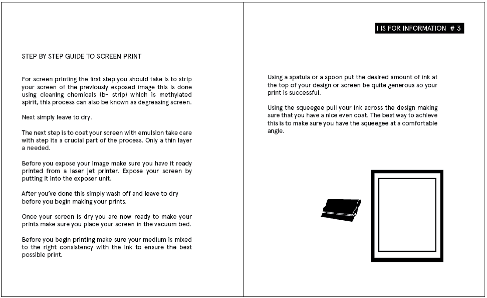
I began the sections by talking about what screen printing was. Then went on to what tools are needed.
I
next took a double page spread to explain the step by step guide to doing the process.
I did the same for foiling. I placed the text in columns on one page and lists on the others trying to keep the column consistency.
Although i did put the step by step in paragraphs rather than a list as they were easier to follow i also added a temperature gauge to represent the heat from the heat press in foiling.
And for laser cutting.
I chose not to do an info graphic for laser cut because i didn't think one was needed or could create one appropriate it enough. I also had to consider my page numbers so i was able to print it as a multiple of four. As a design decision i left it out.
BOOKLET #4
The numbers booklet is more about the technical side of printing and designing.
The first double page spread talks about format and how its important to use the right methods when saving your work. As i only had a small amount of content for these pages. i added an info graphic to represent a pdf.
For paper sizes i didn't want to create multiple pages with different single info graphics of page sizes so i designed a generic paper size grid with no numbers on it.
I decided to touch on paper and stock weights as i think they're really important and you should know the different types for when your designing.
Points and picas are not vital information for designing for print but i felt it would be good to add them in and also try and keep the consistency in content throughout the books .
I added a double page spread about printing costs at LCA so students are aware. This was an important section to add because this specific booklet is about numbers.
Times available to print:
BOOKLET #5
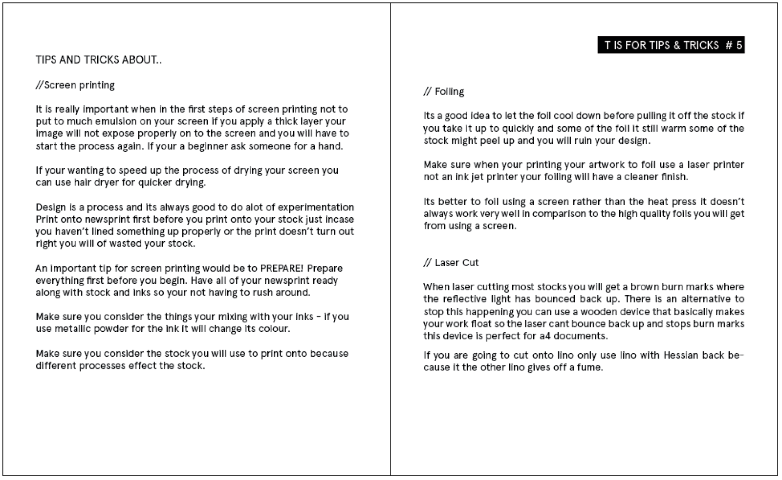
My final booklet is about tips and tricks. I thought this would be a nice chance to add tips and tricks i have learnt throughout the print processes i have tried and to add them in.
I started off by adding in tips and tricks about each of the three processes i had already spoken about so you could refer back to it and make sure you consider the points i made before executing any of these processes.
I made a point about talking about trial and error and things you should check for the most important things i came up with i listed them on the opposite page in large text instead of using an infographic.
I decided to create a double page spread about how long it takes to achieve the certain processes which relates to time and the letter T I've used for this certain letter of the anagram.
I placed more of the information on the left and the last section about laser cutting on the top right also adding a stop watch infographic .
My very last page of the booklets is about time management and tips on how to manage your time and how important it is. I added a small paragraph of text then added a calendar infographic.
Im really pleased with my booklets i think there very simple and straight to the point giving you the fundamentals for printing. Although i would try and play about with spacing and placing of the text if i had chance to re-do this brief. I don't really agree with the way I've used to different styles of placing the text but it was a design decision i had to make for some of the writing to flow properly and to be not only legible but readable.


No comments:
Post a Comment