At the beginning of the session we put our scamps out and we had a little crit where our class walked around the room leaving notes next to peoples work giving everyone feedback.
My feedback
- I think number 3 looks very unique for a website yet it still easily navigated and clear . Awesome
- 1 like the use of illusion within titles. Also like the 3 due to image links ect.
- I think the third one is the best looking and makes most sense navigation wise - more the links at the bottom more left - consider grids
- number 3 good concept very you with the geometric shapes it looks like an interesting website very clear.
- Good playful theme - consider more of a grid
Navigation should always be consistent.
OPEN DREAMWEAVER
We created a group 'wire frame' for the group website.

We created a group 'wire frame' for the group website.

Make sure your working from the user work. Click on index

You can write notes in codes it is public.

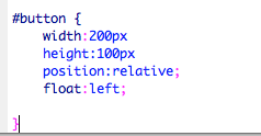
we next added a container this is to add things for the background and style of the website like the width and the height.

We next added the Div which is an ID

We then closed the Div

The next part of the container we added was the background colour i chose green which was one of the 26 colours used for web

This is the preview

The next thing we did was add the position top and left and used 0 which means its right at the top this gets rid of the white space above the green background

The next command changes the DIV so the left edge is half way across its positioned half way across

We next added margin left and half of the size of the page which is 512

This makes this background right in the centre

This next section is to create left margin and to choose a colour

I chose to use the colour black and it appeared on the left hand side.

MAKING THE LOGO
We created a new document in illustrator a web document. we made the measurements 200px by 200px


We next created a roll over image we did this for our button. so went through the same process for creating the image we used for our logo.. We first made a document for web in illustrator with a paper size of 200px by 100px
I typed home using BEBAS typeface.

We created both of these in different layers and saved them both separately labelling layer 1 & layer 2


No comments:
Post a Comment