InDesign Double Spread 'Lion'
Quick sketches for ideas for layouts-


The font i've used for my title for my double page spread is 'HIGHER THAN HIGH' i found this font on the font .com and i think the font represents to me the lion king and tribal.

I made my double page spread and started to pay about with the text to see which position looked best.
Centre aligned

Left aligned


I decided to create some paw vectors to type my title into.


Mockups-


I first followed a grid where i had the text in one large column in between to images on one page and under the title on the other. I wanted the text to be large and take a lot of the space up on the right hand page. I was quite pleased with this mock up design but it looked a little out of proportion..

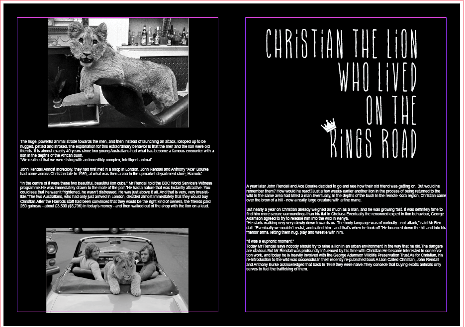


I decied to add a third picture in that i had and make them all the same size and down the centre of the left hand page.i felt this created impact. I think it works well with the negative space and the black and white images.

Where the title was placed on the right hand side it was a little blank so i thought i would add in a another image this made the page looked more balanced.

I had to make sure all the images were the same size and to follow a grid , i wanted it to keep central and in proportion to the title and the other information on the opposite page.


I wanted to use the same type i used for the title to use for the quote id taken out of the text which was 'It was a euphoric moment' I put the quote in the negative space under where the text had finished.

I finally made sure everything was in line and inside the margins so there was enough finger space at the bottom and everything was clear enough to read i wanted to go for a really nice clean cut design and i think i have achieved it.

After my final finished piece i asked a few of my peers there opinion they told me my quote would look better with the quotation marks , the only problem was my typeface i had chosen 'higher than high' didn't have glphys so i had to find a similar typeface to use for the open and close brackets. I also received feedback to make the crown on the work 'king' smaller because it looks slightly like a 'R' and not a 'K' I'm really pleased i asked my friends to give me feedback or i wouldn't of knew what to change and improve on and my double page spread ended up looking better.

No comments:
Post a Comment