MY FINAL DESIGNS:
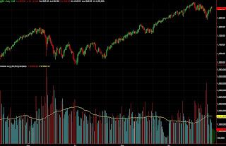
From my research i decided i wanted to souly focus my secret 7 design on a geometric pattern. I obviously wanted to tie in the song and her style of music which for me is electronic so i looked at Music volume bars to get some inspiration.
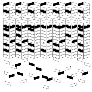
I found an record sleeve whilst researching for geometric shape patterns. Its a collection of cuboids in a repetitive patter i love this album cover and wanted to recreate something similar to execute my album cover.
I first began by making a cubiod shape on an diagonal angle i repeated this and placed them vertically in a line i then used the transform tool to reflect the pattern 90 degree angle, before doing this i copied the original pattern so i could paste it back next to the transformed one to create the pattern below..
The pattern was created using the first strip and repeated 7 times along the record sleeve space. I didn't want the pattern to be completely basic so to make it a bit more unique i used the rotate and reflect tool to change the direction of a few of the shapes so that a different pattern was on top of the original and i made this the same across.
The last part of the pattern was simple i wanted to make a repetitive tessellating style i just copied a cubiod and randomly placed them up and down different sections to create a 'breaking off' affect under the pattern.
I then used the colour black and filled in random blocks all over the pattern. I love using monochrome and i found the colours to be powerful together.
For the next idea i decided to create a love heart that i would incorporate with my pattern. I chose a love heart because the song was about love. I used the OBJECT>PATTERN>MAKE tool to create a swatch of my pattern that i would use to fill in my love heart shape.
I found the pattern actually worked inside of the love heart but the colours didn't work that well i found there was to much white space and the shape didn't really do the pattern justice and it was lost.
Going back to the original pattern i decided to try a different colour background because like the love heart i found the white pattern was to much so tried grey. I felt this made the image stronger and the white squares wernt as lost.
I applied the newly colours pattern back to the heart to see how it turned out. Although the colours work better i still wasn't happy with my design i felt it could be pushed further..
The next step was to try and find a shape that represented love because i couldn't use the title of the song or the artist i wanted to portrait the meaning of the song. I traced over an image of the infinity logo.
I next placed this over the top of the original pattern and i made a clipping mask making the infinity shape is then filled with the background pattern.
I love working with monochrome colours and a minimalist styles so i decided to make the shape smaller and invert the colours so the background colour is black. I think this gives the shape more impact.
After some playing around and experimentation i decided to go back to the original design. After listening to the song i realised the song wasn't just about love and that it was about a complicated relationship and i think the tessellating pattern really represents something breaking up.
The next thing i did was invert the colours so the background was black and the majority of the shapes were white.I took the fill off the shapes and this was what was left..
This is my favourite design out of all of my ideas but i found it wasn't as blocky and powerful as the one with the shapes with fill on. Also a lot of shapes were lost at the bottom. As an overall design i would have picked this one but for the secret 7'' submission i found the two block design more appropriate.
COLOUR EXPERIMENTATION-
After looking at my coloured variations i was still adamant on the black and white i found it more powerful and and simplistic. Im really happy with my final piece and the structure & pattern.
"Tessellating By Victoria Redmond" By Victoria Redmond
For my design I wanted to capture Jessie Wares electronic style of music by using geometric shapes. My interpretation of the lyrics ‘still love me’ is that their situation is complicated.
I used a tessellating theme to portray that she’s trying to fix her relationship but its already breaking apart. Although love is a bold topic I wanted to go for a simplistic style focusing on structure and pattern.
I used a tessellating theme to portray that she’s trying to fix her relationship but its already breaking apart. Although love is a bold topic I wanted to go for a simplistic style focusing on structure and pattern.
Im glad i went with the choice i did as my work got picked. (Top row 3rd )


No comments:
Post a Comment