COMMUNICATION IS A VIRUS - 10,000 STEPS
After first getting into a group we decided to set a weekend task to try a few idea names for our logo and brand identity also draw up some sketches.


We decided to set a task so people could process some ideas and get stuff ready for our group work.After coming up with a few initial ideas for the logo for i mocked up a few digitally to see what they looked like with an idea of what it could be called..


I tried creating a tree mockup that resembled health and had an earthy feel. I think i found it more difficult to come up with ideas for the logo without knowing our exact colour scheme and what typefaces we were going to use....
Our group work is important to everyone of us so we decided to make a Facebook page so we can keep up to date with any changes we might make.

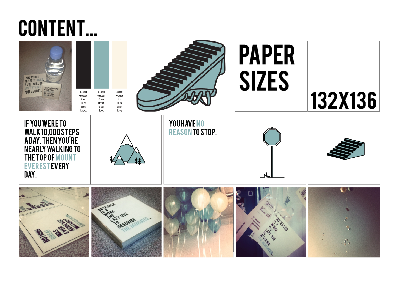
After our crit we changed our idea from making a brand and a kit to a publication showing inspirational quotes to inspire people to walk 10.000 steps a day.We used whatever you think , think the opposite as inspiration.


The pages with the quotes on could be designed into postcard style flyers to give out to people rather than handing out publications. This will cut down printing costs, and people are more likely to accept an inspirational flyer than a publication.
Bebas Regular
For quotes, headings and subheadings

Helvetica Regular
For body copy
Editing the logo - Some people in the group created a logo and we all had a go at changing it a little and asking everybody else what they thought so we could get the best possible result. The first logo was created by sarah i liked it but felt you couldn't see the sneaker in the text just because it was a little small.


I decided to try the name of HIT THE ROAD in a arc , still keeping the circle shaped logo i created a road like vector and placed it underneath the title.


I felt it looked better with the teal like background and inverted the colours so the writing and shapes were black. In the end we went with sams logo he had created for the publication and for the website but we used my logo for the twitter page.
PAPER SIZE - 132x136


Creating mock up pages-

Inspirational quotes:- (FOR PUBLICATION)
Persistence can change failure into extraordinary achievement.
What makes something special is not just what you have to gain, but what you feel there is to lose.
You can motivate by fear, and you can motivate by reward. But both those methods are only temporary. The only lasting thing is self motivation.
If you have everything under control, you're not moving fast enough.
If you aren't going all the way, why go at all?
There are only two options regarding commitment. You're either IN or you're OUT. There is no such thing as life in-between.
Do not let what you can not do interfere with what you can do.
Creating mock up pages i used some inspirational sport like quotes to see what our chosen font and colour theme would look like on our paper size for our publication:-


I tried a few different variations using the chosen quotes i had found, i used some double page spreads using the colour of the stock we had chosen which is antique white. I played around with different colour backgrounds using the other two colours we had chosen (because the creamy colour is the stock colour). I love using black in my work because i think it creates impact but i felt although the creamy colour background was more appropriate. I also tried the most important words in the quote to change them into another colour so they stood out more. Our group decided to go for the theme of the last variation. We also used the same theme throughout our work / website & flyers.


We created a instragram to make our 'hit the road' group more viral , i thought it would be a good idea so we could get people to be more aware of walking and people who have iPhones who find our balloons can tag @hittheroad when they've found one.

POSTERS- Posters were created to raise awareness about 10,000 steps and hit the road, these were placed around uni so it would interest people into viewing our twitter and using our instagram ect. we kept the theme consistant.


BALOON DISTRIBUTION-
With the flyers we had created and laminated we whole punched the top left hand corner and attached the string of the balloons.


LAST BUT NOT LEAST Creating the website- i created a plan for our website so it would be easier to produce than rather create it as i went along. The website would be on a long document that would scroll with when clicking on each link for the next section.

The template of the website- i created the page in illustrator , I made the document width 980px because the peoples computers/laptops have different size screens and 980px wide is the smallest possible screen size so anyone viewing it would be able to see it.


Using the same colour theme as the rest of the website i copied the box into the illustrator document so i could get the right CYMK codes to make sure the colour was exact its important to make sure all of our group 7 work is consistent. The first page was our most powerful fact/quote in our publication i think its really powerful and a lot of people dont know about the information in the fact.

I made all 5 different sub section titles at once and did the same effect with putting the most important words in the teal colour. Creating the second page was about hit the road and who we are i used our logo created by sam and put it above the information.


I created the balloon affect by making a balloon vector then simple placing the balloon over one of the chosen images and creaint a clipping mask this captured the image behind in a balloon shape. I think it gives the end of a website a nice finish rather than just having the images in squares.


I wanted to create a scrolly theme like i had seen in another website so when you clicked on the next sub-section the page scrolled slowly following the design and flow of the footsteps. It would of been a lot more time consuming to place the footsteps down the long page so i decided to create a pattern brush where i would be able to create the swish using the mouse.

I tested different pattern brushes and way of direction before finding the one that looked good. most of them made the feet to small or really stretched. I played around with the pattern brush options until i was happy. I'm really pleased with how the footsteps turned out and i think they give a great look and feel to the website and keep the style consistent.

OUR PRODUCTS - OUR PUBLICATION , & PACKAGING


This packaging features a small plaster box , a bottle of water with our label and a motivational CD you can listen to when your walking.


OUR PUBLICATION PDF FORMAT ....
No comments:
Post a Comment