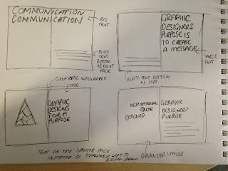
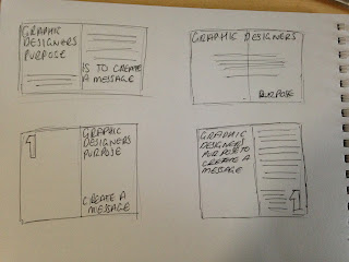
We were asked to create 10 double page spreads the content would be from study task 5 '10 things people need to know about graphic design' This is to inform people 10 important things. We can design the 10 double page spreads how we want with the information we've learnt from our grid & layout sessions.
Getting started :-
Getting started :-
12cm W x 16cm H
Using the skills in the lesson i have learnt i decide to use the fibonacci sequence to create my own paper size for my publication. I used the ratio of 4:2 i felt it would be appropriate size.
MARGINS-
For the margins i wanted to create my own in stead of the standard size to make all the margins the same i had to first select every double page spread in my document and go to the margins and columns option and i went with 16mm for the inside margins so that when my booklet was bound the information wouldn't be to close to the middle.
GRID DESIGNS-
Front cover-
- Graphic designers purpose is to create a message- Graphic design is there to inform in many tones of voice.


For my first double page spread i wanted the left hand side to be a piece of graphic design i had created to go along side my information which was 'graphic designs purpose is to create a message' I felt this would be appropriate although people read left to right i wanted it to be a little different so i changed the normal function and swapped them round.
The grid i created for this was just a simple central grid with the text on the left hand page centre aligned and the text on the right hand page slightly to the left and the centre.
- Graphic designers need to be aware of the primary colours-
I went for the same grid as the page above for this layout. I felt the information on this double page spread should be important and bold and would feature little text and a large image.
For the image i wanted to create my own infographic that people would remember and associate when remembering the primary colours so i decided to make some little simple ice cream cones.
For the second page i wanted it to be straight to the point and have 'Graphic designers need to be aware of the primary colours' i repeated this over and over and realised it didn't look very aesthetically pleasing but over powering.
I finally decided to go for a bold white type agaisnt black background i think its affective and straight to the point.
- Its important to know the different colour modes for different print processes-
For this particular double page spread i knew i wanted large text/header and type also similar infographics for the primary colours one. So i created a grid that had 3 sections i made the columns and the gutters.
I firstly added large bold text for the CYMK & RGB i then made sure all the cones were perfectly aligned and made them all centred and followed the guides. I lastly added in text which used the same font as I've used throughout my publication to keep it consistent.
- An important rule when working with type is to use a maximum of three fonts.
The guide i used for this double page spread was similar to my CYMK & RGB one but i used 4 sections instead of 3.
I wanted to make this one really visual and decided to create an info graphic style poster using different typefaces to fit with the subject of this double page spread.
I next put my 4th need to know quote on the left hand page , i made this justified last line aligned left.
- Semiotics are important-
This guide created was using small columns and gutters i then edited this by deleting guides from the top and bottom.
I put my semiotics information on the left hand side and then chose an appropriate info graphic of a nandos rooster for an example i placed this in the bottom right hand corner.
It did look a little bit unbalanced and i did have to break the grid slightly but it was at the size i wanted. I next put the example information in line with information on the left hand side it then worked nicely as a double page spread. The text fit the grid perfectly.
- Visual Literacy -
I used exactly the same grid as the semiotics for this but i edited and move two of the lines so i could make the title nice and large for the 'lets get visual' double page spread. As the title had 'visual' in it i wanted it to be big.
I placed the text in a series of positions that were symmetrical had there been 4 paragraphs but the gap on the bottom right hand page was where i would place the info graphics that would represent the visuals i used for my example australia.
- Four different weights make up a typeface -
The guide i created for this double page spread was really simple and i created it like this because i knew i wanted to focus this page more on large infographics that were in the shape of weights and i didn't know how much space i would take up. I create and extra guide at the bottom for the title so the page had some structure.
I placed the title at the bottom and then the type with it set to justified last line aligned left. I kept most of the body text size 9pt. the whole way throughout to keep the consistancy.
I created these info graphics in illustrator and copied them over. I decide to make weights because the spread was about the four different weights i then put there specific name inside of the weights.
I then made sure they were all inline to create a nice flowing double page spread with equal content on both pages.
- Difference between typeface and font typeface-
This grid worked really well i created it with 3 main sections and 4 thinner gutters where the information fit perfectly into.
I recreated these letters id found in my research and used these on the right hand page at the top and started to add the first paragraph.
I next added the final information which fit in to the grid as there was 3 main sections.
- Legibility & Readability-
This was my favourite double page spread to do ! I decided i wasn't going to use any grid apart from two ruler guides on the left hand page. For the text to be aligned.
I wanted to make sure i included this i think its amazing and everybody should know about it....
I created these two sets of type in illustrator then put them into indesign. I loved making this 'DOES THIS MAKE ANY SENSE' type using my colour theme and different typefaces. This double page spread was created more on aesthetic choice and the use of breaking the grid! for obvious reasons.

- How many points in a pica-
For my final double page spread i decide to make a guide that would fit a ruler mark for an infrographic then a line to make sure the text fit underneath on the next page but no ruler in the middle just at the bottom so the information could flow.
I designed my own ruler in illustrator and put it on the double page spread on the left hand side in the centre using the teal colour for the type and numbers and black for the ruler.
I added a black background for the right hand page then started adding the information in i didn't want to use a header just white text in line with the top of the writing on the left hand page.
MY PUBLICATION 10 THINGS YOU SHOULD KNOW ABOUT GRAPHIC DESIGN -


No comments:
Post a Comment