Research , Collect , Communicte PRODUCT - How i did it...
Initial Ideas..


Here is my initial ideas my first initial ideas were a booklet , i drew a template out like a magazine layout i would do on InDesign. i worked out what information i would put on each page. After changing my idea to the shoe box and i drew out a template and drew out a timeline. My next part of the process was to make the template to scale on illustrator. I then printed it out on a3 paper to put it together to see if it would work how i wanted


Using these images i began to create my own retro pattern.


My final shoe box design:-
 Inside of my shoe box..
This is the typeface i used i downloaded it its called brain flower it felt it reminded me of skaters and it was playful and light.


For the first section of my vans timeline i talked about from 1966 to 1970 where it all started there was a sentence about how much profit each of the partners made to i felt it appropriate to use vans shoes as a bar chart. I found one of the shoes on line and drew round it with the pen tool i next used the vans logo and placed it on the side of the shoe. i changed the colours of the shoes like already existing shoes and had a different colour for each bar.
2nd section-


I placed the shoe on top of a checker board and i used clipping mask to make the checkerboard fill in the sections of the shoe , it was really easy to do and it looks like the actual van shoe #44.


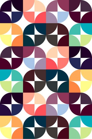

I liked all of these patterns and i feel as though they represent retro and geometric design which is what I'm going for i used tracing paper to trace different sections off different patterns and try and and create a pattern that way. I want something really unique and quirky.
Traced experiments -

More inspiration!


I struggled to come up with a pattern that i felt would work using the traced symbols, so i went back to the root of the design i was looking for which was generally 'retro' & 'hipster' my first thought when think of retro is fresh prince of bel air , and saved by the bell. the shirts they wear are geometric and have lots of different colours. i looked at Kate Moross's work because her works young fresh, & aesthetically pleasing.


Next i looked at a few clothing websites and found exactly what i needed combining the colours and shapes used on Moross's work and some shirt designs i decided to go for a simple minimalist pattern using a few colours and opting for white background to really emphasise the retro theme.
Outside of my shoe box...
First prototype-
This is my pattern design for my box i used it creating simple shames on illustrator , the consistent set of shapes made up of a swirl using the swirl tool, the square tool to create the cuboids and another swiggle using the pen tool. I chose the colours for the pattern to be playful , they are the basic primary colours so i felt it appropriate.

For my first prototype i placed and repeated the selection of shapes in to the template position so i could see what it would look like and position before i printed it out. i next put the vans logo up side down into the top right hand corner because that will be the top flap that folds on top of the shoe box.

I printed this and cut it out to see what it would look like although this wasn't the best idea because the actual model would be printed a1 the shapes would be significantly larger.

Second Prototpye:-

My second prototype :- After speaking to a few people what they thought of my retro design i had some advice to change the colour. I was really set with white but decided to invert it and make the box black and the vans logo white. I next changed the colours of the shapes to brighter colours like purple and orange and then i used a mint colour for the cubiods.

I also made the pattern smaller and more repetitive i thought once i printed if i had left the size of the original pattern it would be to large on the box because i was printing it on A1 so the size of the box would be like an actual shoe box.
After some deliberation i decided to stick with the original colours i decided to make a pattern on illustrator so that it was more symmetrical and flowed better across the box to give it a more professional look and feel.
I created the pattern using the 5 original little shapes which when created went into the swatches pallet so i could use it again.

This is the typeface i used i downloaded it its called brain flower it felt it reminded me of skaters and it was playful and light.
1st section-
For the first section of my vans timeline i talked about from 1966 to 1970 where it all started there was a sentence about how much profit each of the partners made to i felt it appropriate to use vans shoes as a bar chart. I found one of the shoes on line and drew round it with the pen tool i next used the vans logo and placed it on the side of the shoe. i changed the colours of the shoes like already existing shoes and had a different colour for each bar.
2nd section-


For the second section i spoke about #95 & #44 shoe i wanted to create these into a infographics for the #95 shoe it was simple to add a blue section to the front and back of the shoe. For the #44 shoe i deleted the laces section off the black shoe using the pen tool and removed the vans label.


I placed the shoe on top of a checker board and i used clipping mask to make the checkerboard fill in the sections of the shoe , it was really easy to do and it looks like the actual van shoe #44.

I spoke about how in 1944 vans closed there orange california factory began manufacturing overseas in 1944 so i felt it appropriate to use a globe info graphic. I originally created a globe with green and blue and decided to change it to black and white to create more impact. I love using monochrome and i felt it more appropriate when i placed it on this section of the timeline.

I next created a skateboard and decide to put a grit texture on top of the board to resemble an actual skateboard i did this by using the dot pattern vector pack and played about with the colours until i was happy.


For my final section of the timeline for the inside of my shoe box i wanted to use a flag to represent that vans were regonized by forbes 'americas best small companies' so i created a flag using red lines and a blue square instead of doing the original flag with all the stars i went for a simplistic look and placed one star in the bottom right hand corner using the star tool.
To finish off this section i wanted to create a computer to show vans had launched a website in 2004. i used the pen tool and shapes to create this computer i didn't want it to be sterotypical so made the edges rounded.
My final vans shoe box packaging


No comments:
Post a Comment