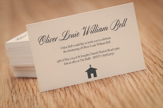
CHRISTENING INVITATION DESIGN
Before i can begin designing i decided to look at a few different colour variations on design seeds so i would be able to get the best variations to fit the clients requests.
TYPEFACES
I next looked at some typefaces and selected a few to start beginning variations with.
CONTENT NEEDED:
I Contacted the client and asked her to give me the following she emailed me back with all the content needed i can begin designing.
Main colours-ivory and silver
style-simplistic
size-postcard
font- Script font
church -st josephs church marton road 12pm
party- The buffs
oliver louie william bell
rsvp 07836652630
date 25th of may 2014
DESIGNS:
I Began by simply placing text over invitations trying different variations.
ADDING COLOUR
I added colour to the invitations using ivory and silver as this is what the client had asked for.
This was my favourite typeface i used i felt it looked like boys invitation and less like a wedding invitation.
FIRST FINAL -
This was the first final i showed the client i really like this invitation and was pleased with the resolution. I constantly sent variations along the way but this was my final and i emailed her it.
My client didn't like the invitation and wanted it more contemporary and traditional using a script typeface.
I shortly after designed more invitations and styles i emailed her she emailed me back suggesting i added a cross she really wanted one and she wanted a script typeface i suggested it looked slightly like a wedding invitation and she should maybe have a serif font in there as well. She disagreed so i carried on designing.
Final four variations-
She liked the second one and we decided that was the final she was really pleased i sent her over the files and she's now had the invitation printed.
FINAL-


No comments:
Post a Comment