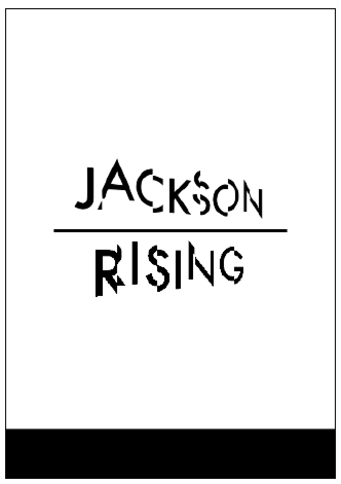
Layout 1 – Minimal Text / image:
Background:
This simple layout will ask you to utilise a short amount of body copy, title, date, and location. The minimal amount of text allows for the simple use of single imagery and the type to serve as the main visual elements.
Brief:
You are asked to produce a simplistic flyer design for Jackson Rising Exhibition at MoMA (Museum of Modern Art – New York) using the instructions below.
Specifications:
Format: A5 – Portrait
Title: Jackson Rising
Sub-Title: Curated by Jenny Dowd
Date: August 3, 2014 - August 31, 2014
Copy: Four artists met at an artist residency at the Ucross Foundation in 2013, now they come together to inhabit at MoMA, New York.
Location: MoMA, New York.
Contacts:
info@jacksonrising.com
www.jacksonrising.com
www.moma.org
Image: Jackson Rising ident / MoMA logo / NYU logo
Use of two colours only: Black and white
(Use embedded InDesign file and follow grid.)Save as PDF file.
THE TASK :
To begin the task i simply opened up the indesign doc with the grid already set up to begin designing and droping in the content.
To begin the task i simply opened up the indesign doc with the grid already set up to begin designing and droping in the content.
TASK 2
This text/image heavy layout will ask you to utilise body copy, title, date, and location, heading, sub heading, imagery, indexes, highlighted quotes. The amount of text allows for the use of imagery and the type to serve as the main visual elements. Brief:
You are to layout and design a 10-page concertina folded brochure for a forth-coming exhibition titled ‘Jackson Rising’ at MoMA, New York. All images, copy and branding are included. You have to create a visually stimulating layout that showcases the artists’ imagery but does not sacrifice important information in this process. The images and information must flow harmoniously and offer a taste of what is to be expected during the exhibition. Branding elements must be kept to black and white. Images must be unaltered and in colour.
Considerations:
Headings, headlines, body copy, grid, type, colour, image sizing, bleed, margins, flow, audience, narrative, language, purpose, size, external print methods, preparing for print, stock, distribution. Specifications:
Format: A5 x10 – Portrait – Concertina spread (front and back).
Title: Jackson Rising - Curated by Jenny Dowd
Dates: August 3, 2014 - August 31, 2014
Location: 11 W 53rd St, New York, NY 10019, United States
CHECK WORD DOC FOR EXTRA INFO - INTRO , ARTISTS & CONTACTS.
Concertina:
Using a similar style for my poster i slightly altered it for the front cover of the concertina.
I used Apercu for body copy throughout keeping the aesthetic minimal. I decided to make the artists name in a large sub header text vertically along the side of images.
For some pages i kept the theme really simple by using only imagery.
On the last page i put an image by Ruth Boerefijn and the contacts plus more info.
Final:
I decided to produce a simplistic ticket for the exhibition using the same copy and branding as the concertina and flyer.
Ticket for the exhibition:
I really enjoyed this mini brief it helped me to experiment with layouts and having to work to a specific grid. I liked how we had to use the given collateral for the flyer and concertina it made it more challenging.
Concertina:
Using a similar style for my poster i slightly altered it for the front cover of the concertina.
I used Apercu for body copy throughout keeping the aesthetic minimal. I decided to make the artists name in a large sub header text vertically along the side of images.
For some pages i kept the theme really simple by using only imagery.
On the last page i put an image by Ruth Boerefijn and the contacts plus more info.
Final:
I decided to produce a simplistic ticket for the exhibition using the same copy and branding as the concertina and flyer.
Ticket for the exhibition:
Other proposed collateral :
I really enjoyed this mini brief it helped me to experiment with layouts and having to work to a specific grid. I liked how we had to use the given collateral for the flyer and concertina it made it more challenging.


No comments:
Post a Comment