MATCHBOOK TYPEFACE
As me and Beth decided to design two typefaces for the brief I began or working on a san serif typeface and adding to type face to create a serif.
The initial inspiration behind the style of font i am designing is the one used in clash magazine.
Sub header text-
SUB HEADER TEXT
I first began by adding weights to the different part of the type antimony to make them different this typeface i am designing is going to be used for the sub headers.
Adding to the letters was easier for some of them then others.
I added a rounded stroke to the left hand side of the letters making them into a san serif type.
Some of the letters were more difficult and i ended up having to place the stroke on the inside of the letter 'O'
I decided to design another typeface as i wasnt happy with the one i had created.
TYPEFACE 2
SUB HEADER TEXT
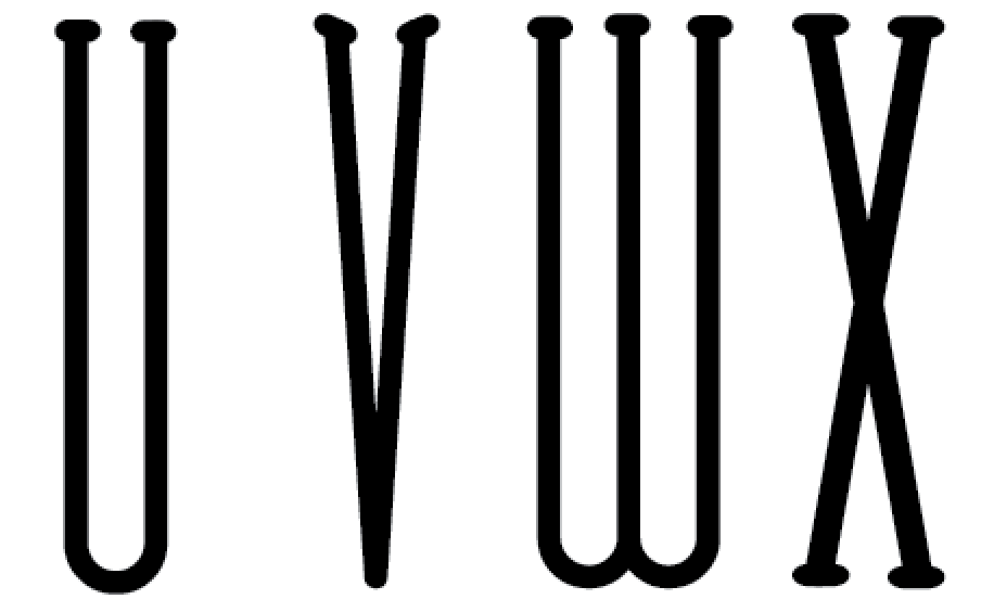
For this typeface i began designing i used an existing typeface same as before and began placing strokes on the bottom of the letters.
I simply placed a small stroke inside of the letter 'O' the same width as i had used on the bottom of the other letters.
Typeface full -
Putting into grid
I next put it into a new grid making sure everything was lined up together.
Finished typeface-
I am really happy with the final result and I'm glad i tried again at modifying an existing typeface than sticking with the first one i began designing. Now me and Beth can try it along with her and see how it looks and if it works for the spreads.


No comments:
Post a Comment