ASOS APP
Before i began mocking up the app that i would have made i made a big mind map so i could finalise all the final categories and what order the app would be displayed in.
For the d&ad brief i also decided to produce an app. To begin mocking up i create a few initial ideas and began developing.
I made a large mind map to note down the Asos App start to finish and each page of the app and where each page would lead to next.
Sketches of what will go onto each page of the App.
I decided to keep the theme and use a monochrome pattern on the landing page for the app.First testing it with bright green , simply white and then deciding on Grey as it works well with black and white and is also a unisex colour.
I made a document in illustrator with multiple art boards with the measurements of an iPhone screen and began putting my designs in order within the art boards following my sketches for reference.
I decided to mockup my loading page as a poster and on an iPhone to see how it looked and if it had enough impact.
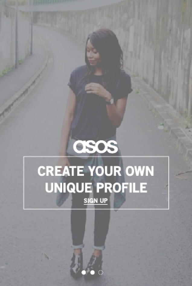
I decided to changed the word revive to white so it stood out more. I used a modelling picture given to me by carmel and changed the opacity to 50%.
At this stage of designing i had got the illustrations of the clothes designed by Carmel so i began making these pages first.
For the live feed page this is the first page you would see i made it as though it was already existing so there was friends currently posting there fashion to a live feed. I kept the consistency like the look book using the geometric pattern at the top of pages.
I also created tabs so that you have the option to like and comment on peoples daily edits that they upload.
Also a 'home' button a 'search' button a 'revive' button a 'notifications' button and finally a 'more' button.
The search page which is next gives the options to look at your friends there locations there uploads and shop on asos.com.
Once your clicked on a specific section the tab at the bottom will highlight black so you know which page you are on.
Revive page -
Location page i used an image of a friend wearing asos clothes this page has been designed so that people can view your location photographs when your out and about.
Daily edit - uploading your own clothes.
Purchases page you can share what you have recently bought so people can search and buy your fashion finds.
More - Gives the options to look at saved items , your friends and settings.
FULL APP TOGETHER -
FINISHED PRODUCT-


No comments:
Post a Comment