Anatomy of Type - Systematic
In the session we stuck our different versions of the different typefaces at the most readable pt sizes and stuck them in a row on the wall. We found larger regular fonts easier to see from a distance and smaller regular fonts easier to see up close. Bold fonts were less readable than the others simply because the the spacing between the words is reduced, and the word reads as a block.
Script font grows apart if its to big. Your eye can't focus on one thing because the ascenders & defenders to big. you can use script for small body copy e.g wedding innovations. Words written in uppercase letters are less readable. They rarely have disenders . They are used. They are used for headline because our minds read the first and last letter.Gothic fonts are more appropriate for editorials, because there is a small text and more columns unlike a book.
Our task:-
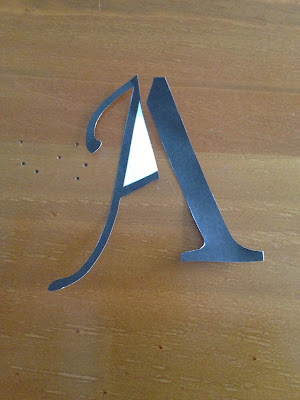
The Process - Use the individual anatomical elements of your chosen fonts (Gothic, Roman, Block, Script) to create a range of possible new letterforms.
- Cut the individual ellements out and re-construct them in order to create a series of Hybrid leterforms.
- Select the 5 most succesful/interesting/legible letterforms and produce the uppercase and lowercase Aa, Bb, and Cc
- Trace these off and hand render them.
- Using the same approach to hybriding create the appropriate upper case Xx, Yy and Zz for each of the 5 new fonts.
Georgia & Gothic ....
Impact & Monotype...
Here is a photo book of my other images of dissected letterforms..
Open publication - Free publishing - More book
Using tracing paper and the two typefaces i will create the other 5 letters , b c x y z.
The first letter i picked from my photographs was-
Gothic -Georgia
Gothic -Georgia
GEO-THIC12
Monotype - Georgia
GEOMONO-SCRIPT
Monotype - Impact
M-IMPACT1
Georgia - Impact
GEOPACT
Gothic - Impact


No comments:
Post a Comment