Thursday, 30 January 2014

Responsive - ASOS D&AD Brief - Concept

ASOS BRIEF - CONCEPT

For the asos brief i am collaborating with a fashion student called Carmel Woolmington from LCA we decided to meet up so we could brain storm and get our concept onto paper before we began designing. We began by looking at the brief so we thoroughly understand the creative challenge before we could begin researching.

First i re-wrote the brief-

Brain storming -

Concept - We decided after discussion to design a virtual wardrobe where you can upload and image of your face and try on different items of clothing. But not only does the app feature one size of body shape but multiple so you can really get a feel for what you would look like in the certain clothes.

In addition to the app we've decided to also propose a concept were somebody wearing the certain clothes could in fact take a picture of them self and send it to e.g.. #asosonlocation and it will appear on asos , instagram ect. so people can see what the specific clothing items look like in the locations such as festivals clubs , restaurant. We think this will improve the social media side of the company and improve bring more customers to the brand.

We will show our concept over a series of images in a created look book.

Others thing we will consider : 

  • Look into Existing Fashion apps
  • Considering programmes we will use .. ISSUU , Olapic , Instagram
  • Our concept is up dateable
  • Using WGSN for future brand predictions
  • Style - Prints & Fashion Illustrations
  • Supporting material - sketches & boards
  • Websites : WGSM , style.com , Asos , eppendalil - Design studio.com

Examples :


Moodboards and sketches like this example-
Olapic-

ACTION PLAN -

For the next time me and carmel meet up we decided to make some key points we need to research and look at:

  • Typefaces
  • Colour 
  • Patterns
  • Print
  • Sketches
  • Silhouettes
  • Trends
Im really looking forward to working on this brief with carmel we've made a good starting point and have our concept we just need to research more in depth and start sketching some ideas.

Tuesday, 28 January 2014

Secret 7 Evaluation

SECRET 7 EVALUATION

MY FINAL - 


EVALUATION-

For the secret 7 brief i drew my own interpretation of a bar that is sang about in the song i am really pleased with my final design it took me a while but i was happy with the outcome. I think i researched quite a lot of existing work and album artwork to try and find some inspiration.

Problems i faced with this brief would be getting an initial idea it took me a long time to finalise what i was going to do and make a solid decision. I felt i was researching for a while until i was happy with my concept.
In future i will perhaps sketch more intial ideas as i think i wil come up with an idea perhaps quicker than researching.  

It took me a while to draw the bar out as there was so many line and shapes involved but it was definatley worth while.I don't think it was well known thats what they were singing about in the bar which made me like the concept more i like that my design wasn't obvious and it was subtle i used black and an off white to represent a homily feel  i didn't want to just use black and white so i used the off white to make the sketched bar have more impact.  

A plus of entering the competition is that its a really good brief its so open for you to put your own spin or interpretation of a song which i think is important as a designer as you can find what your strengths are. Overall im really pleased with my design and i was lucky enough to have my design picked for the second year in a row and be featured on the secret 7 website and in the exhibition. 

This has been one of my favourite competion briefs although i am happy to get picked for the second time i can tell my level of work has improved from first year and want to push that even further.


Secret 7 - Boards

SECRET 7 BOARDS

For the end of my brief secret 7 i put some boards together to show what was exactly asked in the brief , the research behind my concept and my final pieces.


Monday, 27 January 2014

Research Boards - Study Task 1

RESEARCH BOARDS

These are my boards i put together with the research i had collected about pattern design.

Printed textiles & Pattern Design.
Artists/Designers/Printmakers
 Paisley print.
 Mandala & Tapestry
 Fashion


Study Task - 1 Research Topic

RESEARCH TOPIC

For my research topic i first began by making a mind map of what i liked and what interests me. I felt this would be beneficial to help me pick the most appropriate topic.


 After making some notes i realised i would research pattern design as it interests me a lot and i feel although i will be able to get all out of this topic . I next made a another mind map listing all the different points i could consider when researching this helped me make my research more focussed and helped me plan what i would look at first.

Responsive - Secret 7 Designing

SECRET 7 DESIGNING

For secret 7 i chose to design for Elbow with my initial sketches done i first began by playing around with a texture and a circle to give the impression of 'the hole in my neighbourhood' spoke about in the song. I made a simple gradient and then i began playing around with layers in photoshop to achieve the best result.


I really liked the effects i was getting but thought i would try other variations so i could develop my idea.
With the theme of alcohol in the song i tried the texture within the cocktail glass shape.


I next began going through my initial sketches to begin more developing i next started designing a sofa simply made up of rounded squares i next tried it inverted so the outline was the only colour.


After some initial mockups i decided to go with my strongest idea i had drawn up and began drawing the bar that is spoke about in the song.

I began by making a crescent shape for the top of the bar. I achieved this by makin a circle and then using the minus front tool to cut the shape in half.

I next drew to parallel lines either side of the semi circle.
I next created arches to represent the arch way.
I began adding the lines to the back and to the front this started making a flat image look more 3d.

To make the gate at the side i simply made large posts gradually going to smaller posts using a ruler and guide to make sure they were even.


I then copied it and flipped it 90 degrees vertical so that i could get the a symmetrical copy of the gate.


I then placed them on both sides of my arch way.

To make the gate at the back i simply used the same technique except i kept all the bars the same instead of ascending.

I placed them all in a line and joined up the lines using the join tool in illustrator. 
I added in black bars with the pen tool in illustrator.
I then made a black shape using the pen tool to create depth so it looked like the hole where you walk down to the bar.
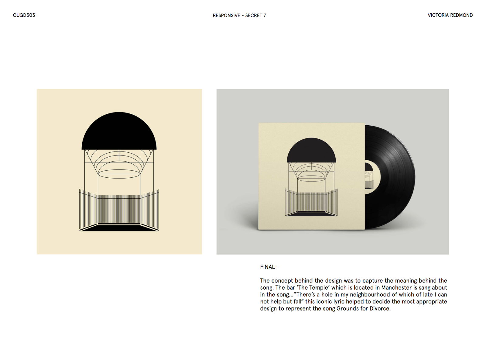
This is my final design.
I next tried to get some variations using the previously made texture and layers in photoshop . Some of the layers didn't work very well and the design become distorted. 
Some where unclear and didnt work well.

I felt although some of the images worked with the one colour backgrounds and became bold.

Overall i decided to keep the design black on the off white background I'm really happy with my final design.


My concept for my design was to capture the meaning behind the song.

The bar ‘The Temple’ which is located in Manchester is sang about in the song…"There's a hole in my neighbourhood of which of late I can not help but fall" this iconic lyric helped me decide the most appropriate design to represent the song Grounds for Divorce.