10 THINGS PEOPLE NEED TO KNOW ABOUT GRAPHIC DESIGN
- Graphic designers purpose is to create a message- Graphic design is there to inform in many tones of voice.
`
- Graphic designers need to be aware of the primary colours-
- Its important to know the different colour modes for different print processes-
- An important rule when working with type is to use a maximum of three fonts.
- Semiotics are important-
- Visual Literacy -
Pictograms are International , e.g.. In airports signs are recognisable from people of all languages so they can understand them. Visual - Metaphor Metonym Synecdoche
'Work the metaphor every object has the capacity to stand for something other than what is apparent. Work on what it stands for.'
Visual Synecdoche - This term is applied when a part is used to represent the whole, or vice versa. Quite simply , the main subject is substituted for something that is inherently connected to it. This Substitution only works if what the synecdoche represents is universally recognised.
Visual Metaphor - A visual metaphor is used to transfer the meaning from one image to another. Although the images may have no close relationship a metaphor converts an impression about something relatively unfamiliar by drawing a comparison between it and something familiar.
Visual Metonym - A visual metonym is a symbolic image that is used to make reference to something with a more literal meaning. For example a cross might be used to signify the church. By way of association the viewer makes a connection between the image and the intended subject. unlike a visual synecdoche, the two images bear a close relationship, but are not intrinsically linked.
- Four different weights make up a typeface -
Gothic - impact
Monotype Corsive - Script Brush
News Gothic - Sans serf
- Difference between typeface and font typeface-
A design for a set of characters. Popular typefaces include Times Roman, Helvetica, and Courier. The typeface represents one aspect of a font. The font also includes such characteristics as size, weight, italics, and so on.
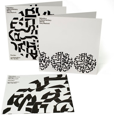
There are two general categories of typefaces: serif and sans serif. Sans serif typefaces are composed of simple lines, whereas serif typefaces use small decorative marks to embellish characters and make them easier to read. Helvetica is a sans serif type and Times Roman is a serif type.
Arial bold is font
- Legibility & Readability-
Led tracking & Kerning .. It was used to put a gap between the letters in the printing press.
What makes a font readable - leading size , in-between & around.
'Accdroing to a reseacrh at Cmabridge Unrveisity, it dseon't matter in waht odrer the lteters in a wrod are. The olny iaportmnt tihng is taht the fisrt and lsat lteter be in the rihgt plcae.The rset can be a ttoal mses and you can slitl raed it wuthoit prlboem. Tihs is bceause the huamn mnid deos not raed eevry leettr by iteslf, but the wrod as a whole.'
Legibility Is the degree to which glyphs (individual characters) in text are understandable or recognisable based on appearance.
Readability Is the ease in which text can be read and understood. It is an influenced by line length , primary, secondary , leading justification , typestyle , kerning tracking point size ect.
- How many points in a pica-
Point is the size of a letter:
1 point = 1/72 inches =
25.4/72mm =
0.3527mm
25.4/72mm =
0.3527mm
12 points = 1 pica


No comments:
Post a Comment