Thursday, 20 February 2014

Monotype - Design Decision Making

DESIGN DECISION MAKING 

Meeting with Beth on the 20.2.14

Me and Beth got to together for our meeting and we began creating some type decisions and creating some digital mockups we each took a role and beth worked on the type side as i began making some mockups.

We decided that we would:
  • Use three typefaces - 
One of Body Copy , One for sub header , & A more decorative type for the cover and headers.
  • We decided we would use simplified layouts that are more aesthetically pleasing that the layouts used at the moment.
  • Use pages to talk about  the new app. ( Using the decorative type)
  • We will use clash magazine for reference.
  • We will continue to research and get wider range of events.
  • We will select content from the previous issue as well as developing our own content for new features.
For the next meeting we will carry on researching and focus on events and extra information we can include.

Monotype - Layout Mockups

MONOTYPE - LAYOUT MOCKUPS

FRONT COVER

As one of my set tasks within the pair for collaborative i experimented in indesign to produce some different mockups and layouts of where text and images would be placed.

Firstly for the front cover-


INSIDE CONTENT -


I felt using large images on either one of the double page spread pages would be similar to fashion magazines with large bleeds and would make the newly designed big issue more aesthetically pleasing.

Columns and smaller images - 


I will use some of the above layouts to mock up layouts of the big issue content as a point of reference. I'm glad i decided to do this as its helped plan where the work will go on the pages.


Tuesday, 18 February 2014

Study Task 2 - Mockup & Packaging

STUDY TASK 2 - MOCKUP & PACKAGING

MOCKUP


PACKAGING

My first thought for packaging is to produce a envelope like the image below using some type of thread or string to attach it all together.

I designed a similar net-

The next image is an example of wrapping that has been designed to open up to reveal the product. I like this idea wether or not the packaging would be relevant for my publication i will need to test it.


I really like the binding method used to hold this envelope together using silver studs and black card to make it secure and sturdy.

Sleeve Design-


DOCUMENTS FOR CRIT

Prototypes & Mockups


Study Task 2 - Concept

STUDY TASK 2

Task
You will produce at least one mock up, with content and initial layout ideas, of your publication for the crit on the 26th. Ideally, this product will act as a proof before you go to print, so you can get an idea of how the content and the layout are working and so minor issues (such as typos) can be rooted out. Although bringing unbound pages can be useful, a mock up of the publication itself is most useful, so do make a mock up of this product. Note that this does not mean that you have to use the same stock or even the same binding technique -- but a good physical representation is what we are after. We don't expect you to have all the research done at this point; however, we do expect it to be quite advanced. Please expect for these mock ups to be written on.

This is also an opportunity to improve upon your crafting skills. As such, we want you to create packaging to house your publication -- at least three nets -- in order to hone crafting skills as well as your design for packaging skills. Please bring these constructed net mock ups as well as your publication mock ups to the crit on the 26th.


MY CONCEPT


Sunday, 16 February 2014

Responsive - Christening Invitation Design

CHRISTENING INVITATION DESIGN

Before i can begin designing i decided to look at a few different colour variations on design seeds so i would be able to get the best variations to fit the clients requests.


TYPEFACES

I next looked at some typefaces and selected a few to start beginning variations with.


CONTENT NEEDED:

I Contacted the client and asked her to give me the following she emailed me back with all the content needed i can begin designing.

Main colours-ivory and silver
style-simplistic
size-postcard
font- Script font
church -st josephs church marton road 12pm 
party- The buffs 
oliver louie william bell
rsvp 07836652630
date 25th of may 2014

DESIGNS:

I Began by simply placing text over invitations trying different variations.


ADDING COLOUR

I added colour to the invitations using ivory and silver as this is what the client had asked for. 
This was my favourite typeface i used i felt it looked like boys invitation and less like a wedding invitation. 


FIRST FINAL -

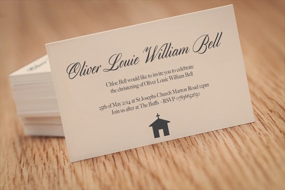
This was the first final i showed the client i really like this invitation and was pleased with the resolution. I constantly sent variations along the way but this was my final and i emailed her it.


My client didn't like the invitation and wanted it more contemporary and traditional using a script typeface.


I shortly after designed more invitations and styles i emailed her she emailed me back suggesting i added a cross she really wanted one and she wanted a script typeface i suggested it looked slightly like a wedding invitation and she should maybe have a serif font in there as well. She disagreed so i carried on designing.

Final four variations-


She liked the second one and we decided that was the final she was really pleased i sent her over the files and she's now had the invitation printed.

FINAL-