Thursday, 6 December 2012

Photoshop workshop 6.12

Photoshop Workshop

 To import our images we went to file>script>loadfilesintostack

We added all the images in at once from a file i then we selected create smart object

once the image had finished loading the images you can see in the layer panel , that says smart object.
 We next went to layer>smart objects>stack mode>median. This was to remove all the people from the image.


We went back through the images and found one that the sky was clearer on. we copy and pasted the image on top of the original image we had just removed the people off.
 We selected the sky and selected inverse we then pressed delete. This was what we were left with.. 
The original image without the people and the new sky.

Postcards


Tuesday, 4 December 2012

The Language of graphic design OUGD404

Visual Literacy - The Language of Graphic Design.
Semiotics - Sign Symbol Signifier
Visual - Metaphor Metonym Synecdoche

'Work the metaphor every object has the capacity to stand for something other than what is apparent. Work on what it stands for.'

Visual Synecdoche - This term is applied when a part is used to represent the whole, or vice versa. Quite simply , the main subject is substituted for something that is inherently connected to it. This Substitution only works if what the synecdoche represents is universally recognised.

Visual Metaphor - A visual metaphor is used to transfer the meaning from one image to another. Although the images may have no close relationship a metaphor converts an impression about something relatively unfamiliar by drawing a comparison between it and something familiar.

Visual Metonym - A visual metonym is a symbolic image that is used to make reference to something with a more literal meaning. For example a cross might be used to signify the church. By way of association the viewer makes a connection between the image and the intended subject. unlike a visual synecdoche, the two images bear a close relationship, but are not intrinsically linked.

' In trying to separate words from pictures we have to accept that words are 'pictures of letters' ' - David Crow

Think different.

If you're not failing every now and again, it's a sign you're not doing anything very innovative.
Woody Allen 

The Anatomy of Type Part 5

"Type is speech made visible"

Legibility&Readability 

With a newspaper the first thing you look at it is the name of the paper , the tabloids do this by putting red tops on there text. When text and things are positioned together there harder to read and becoming less visually engaging.

If you can't make it good make it  BIG  if you can't make it big make it red.


Monday, 3 December 2012

How To.. Get people to donate more OUGD405

How to..
For our how to brief in our group we had come up with the question of 'How to get more people to donate' , this was decided after our group crit. We needed to come up with an idea that would make an awareness and  a difference and help answer our question.

We decided to give out free hugs to race awareness for a local charity as it was a friendly and playful thing to do. We chose scope charity, which is a local charity in leeds city centre. Scope is a charity for disabled people and help and support for there families.

We first wanted to raise money for Scope by giving out hugs, We would initially charge 10/20p a hug and all the money raised would go to scope. Due to the time scale we had we were only able to raise awareness and not collect money as we needed a licence. 

We got peoples attention by using a large picket board and giving out stickers and leaflets.. we used a honey monster consume for the person initiating the hugs. We found the costume suitable as it was playful and had the same colour scheme as the scope logo.

We first looked at who needs to know :

  • women aged 45-64 give the most
  • women & men ages 16-24 give the least hence our primary target audience
  • Our idea should be applicable to all age ranges, however focusing on ages 16-24

What we looked at:


Primary research proposals - night clubs , pubs , university unions. 
Who? Phoning different charities , Scope agree on our idea.
Where?Town (age demographics)

Action plan:-


What we created:

To start off with we made the picket board, we used a font called Catatan Perjalanan its a thick bold font that works well with the mascot and the playful theme. It also looks like the honey monster font. The font we used was called 'Catatan Perjalanan' i found this font on dafont.com.


This was the poster we used for the picket board to grab peoples attention we used purple and yellow colours to carry on the theme throughout the project. We wanted it to be straight to the point and raise attention and awareness.We also included the scope logo so people knew which charity we were supporting.
This is the front and the back of the scope leaflet used to give people a little information about the charity so they can see who there giving there money to and where it actually goes.

84% of the money goes to the cause
9% of the money goes to company expenses
&% of the money goes to the investments of future funding

We believed these leaflets would be beneficial and important to give out to people so they knew what scope charity was about. for eg. If we were to of collected money on the day for the charity people would be interested to know where there money went.

These are the stickers i created , using the honey monster as our mascot because he's friendly and playful. We used the image of the honey monster along with the same typeface we used for the rest of the the promotional items & presentation. We used these stickers to give out to people who the honey monster gave hugs too!

This is a pie chart to show the percentage of people who say that they would donate to charity for a free hug.
We put together a video to show the honey monster in action!


Why We Research OUGD405

Why we Research?

In freds session - in groups we made a list of different reasons why we research, what problems we face and how we can solve it.

We first created a brain storm for our specific topic. To get our focus point.

More donations-
  • success stories
  • reduce salaries of executives within the charities
  • more information - money where it goes
  • more informative advertising

Things that we can do :
  • Giving out questionnaires: Specific , primary research, get the answers you need.
  • Visual Influences: Visiting galleries , design skills beneficial to see others work.
  • Reading related books ; Large body of secondary research , everything  published in the book is genuine.
  • Attending lectures and seminars: To obtain specific information on your subject, in a reliable form.
  • Taking photographs to show visual documentation of specific event sand locations which directly relate to your subject.
  • Searching your subject on the internet, to find many sources to base research from.
  • Research media which directly correlates to your subject.  


Reasons why they work for our specific topic - charity:

Questionnaires:-
  • Figures about how many people donate
  • Opinions about how charities manage their money.
  • Facts wether something donates
Visiting Galleries:-
  • Visual stimulation held generated ideas
  • Information leaflets about your exhibition
  • Photographs which you take for visual documentation
Reading Relevant texts:-
  • Finding specific information such as statistics in charities
  • relevant information such as figures from a certain year
  • facts what the charities do
  • figures how many people donated last year.
Searching your subject on the internet:-
  • Opinions, blogs of charity workers/volunteers
  • Photographs of how the money is affecting the recipients
  • figures of donation on the charities , websites
Attending lectures & seminars:-
  • Informed opinions of educated tutors such as there opinions on the corruption of charities
  • Large amounts of information, which may relate to charity history.
Problems we may find when trying to research:-
  • Not enough time to research
  • Not having the resources
  • money(not having it)
  • Lack of motivation
  • Not having the time to visit exhibitions
  • Not having a camera to take photographs
  • Not having the social confidence to ask people questionnaires.
Things that will help this:-

  • Keep up to date - solve contemporary problems.
  • To focus on your target audience
  • To get a better understanding
  • To be able to make informed decisions
  • To develop your own opinion
  • To help develop a range of ideas
  • To have a greater knowledge of your subjects
  • Visual influence
  • Visual interpretation and opinions of others.

Thursday, 29 November 2012

Photoshop Workshop 29.11

Photoshop Workshop

This image was taken by a digital camera which captured the light. When printing the image it wouldn't keep the light as strong. You can change the colour image in image>mode>
You can change the image to CYMK instead of RGB this will show how the image will look when it is printed.


 Clicking on the Gamut Warning shows all the colours the CYMK cant.
Underneath the layers theres a button where you can create a new adjustment layer.
We tried using the brightness and contrast to get the original colours back but it was unsuccessful.
We found hue & saturation was more successful i moved the hue to the right at +149 , and moved the saturation down to -34 i left the Gamut warning on whilst doing this so i could see how the colour was changing.

Next Image
Creating adjustment layer
I made a new adjustment layer and clicked on levels. i move the middle arrow over to the left so the image would go brighter.
We selected in the layer mask where it says level. We clicked on the paint brush and made the fore ground colour black.We then changed the brush we were using to a soft smaller brush.
We repeated the same process with another image, its really easy to make a image lighter and use the layer to fill in darker places in the images with a brush.
For this next image the image been taken of the statue has to much light. The statue is dark and the image doesn't look very good. We selected the quick selection tool and we created an adjustment layer > levels.
We moved all the counters along the line to the left so they were all in the histogram. The image became immediately brighter and more detailed.
 
PhotoMerge
For the photo merge we clicked FILE>AUTOMATE>PHOTO MERGE We then selected 3 images from our file and clicked Auto and the ok.
 It took a few minutes to render then the image looked like this , all 3 images seamlessly put together.
Lastly we cropped the image so we got rid of the access grid from the outside.

Tuesday, 27 November 2012

THE BIRTH OF A FONT Systematic OUGD404

Anatomy of Type - Systematic

In the session we stuck our different versions of the different typefaces at the most readable pt sizes and stuck them in a row on the wall. We found larger regular fonts easier to see from a distance and smaller regular fonts easier to see up close. Bold fonts were less readable than the others simply because the the spacing between the words is reduced, and the word reads as a block.

Script font grows apart if its to big. Your eye can't focus on one thing because the ascenders & defenders to big. you can use script for small body copy e.g wedding innovations. Words written in uppercase letters are less readable. They rarely have disenders . They are used. They are used for headline because our minds read the first and last letter.Gothic fonts are more appropriate for editorials, because there is a small text and more columns unlike a book.

Our task:- 
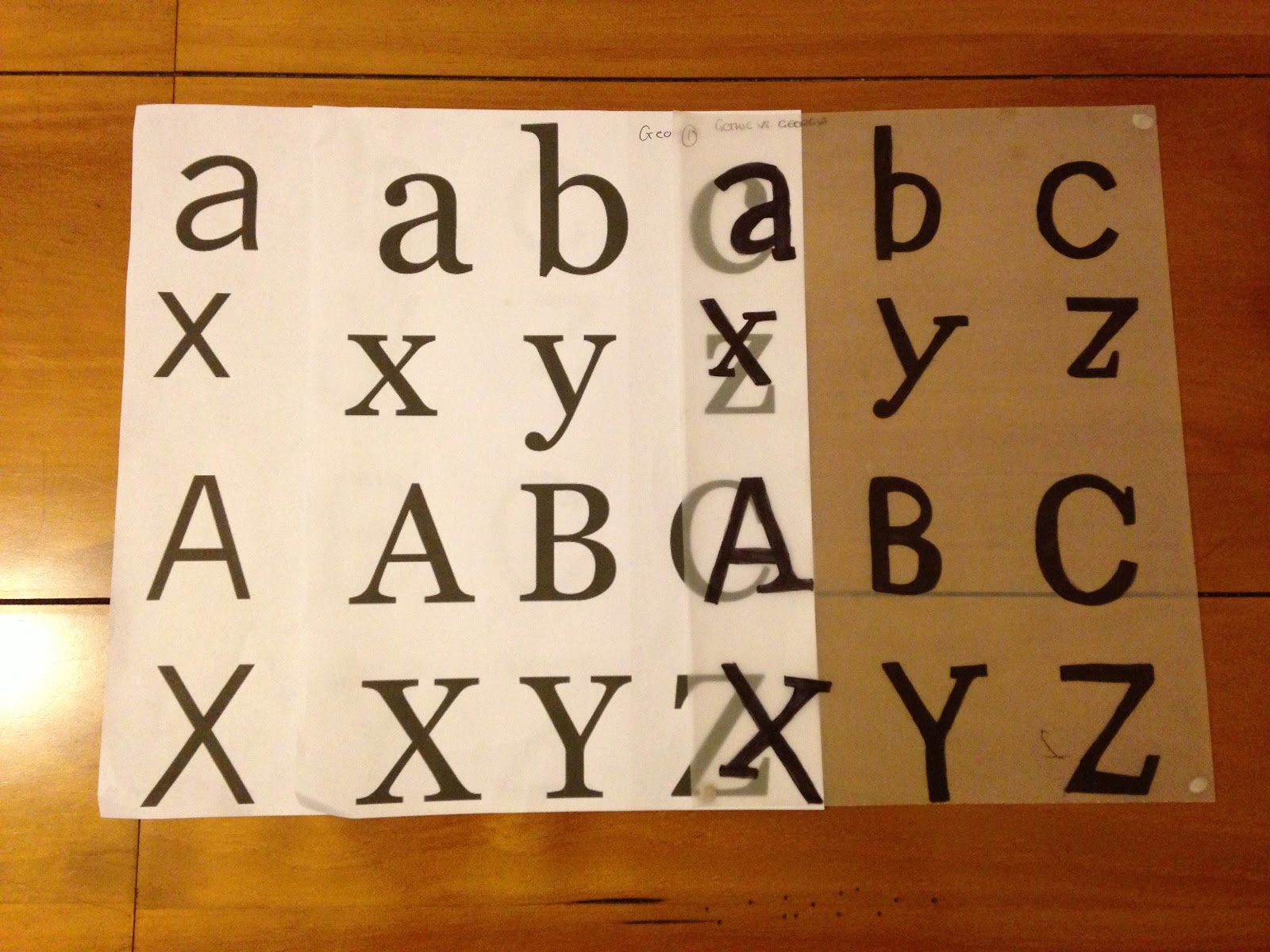
The Process - Use the individual anatomical elements of your chosen fonts (Gothic, Roman, Block, Script) to create a range of possible new letterforms.
  •  Cut the individual ellements out and re-construct them in order to create a series of Hybrid leterforms.
  •  Select the 5 most succesful/interesting/legible letterforms and produce the uppercase and lowercase Aa, Bb, and Cc
  •  Trace these off and hand render them.
  •  Using the same approach to hybriding create the appropriate upper case Xx, Yy and Zz for each of the 5 new fonts.
I firstly directed all my letters so i could use them to move them around and create another font. 

Georgia & Gothic ....
Impact & Monotype...

Here is a photo book of my other images of dissected letterforms..

Using tracing paper and the two typefaces i will create the other 5 letters , b c x y z.
The first letter i picked from my photographs was-

Gothic -Georgia 


GEO-THIC12


Monotype - Georgia


GEOMONO-SCRIPT


Monotype - Impact


M-IMPACT1


Georgia - Impact


 GEOPACT


Gothic - Impact


THIC-PACT BOLD