Speaking from Experience...
For this brief me and J'nae have teamed up to make a perferated booklet for the new first years, it will consist of do's and donts mainly focussed on the donts, telling the new comers what not to do to avoid looking stupid!.
We will consider print method , type , layout stock & colour.
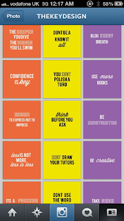
Concept:- create a collection of do's & donut's - flyers perforated concertina informative - yet humorous. Focus more on fonts. own created quotes from our experiences. Geometric simplistic. Own created type- Handwritten fonts. Possible screen print. The perforated flyers you can pull off stick to your wall. Instagram & e-book.
PRESENTATION BOARDS FOR CRIT -
BRAIN STORM FOR OUR IDEA-
SPLITTING THE JOB LOAD - After our progress crit we realised our content wasn't going to be sufficient enough for the time we had or number or people we had in our group so we decided to add some things to our initial idea. We decided to make a motivational pack which will have our 3 concertina flyers plus a blog , instragram , posters and shirt & badges which we will experiment with a range of print methods. we will also find our colour choice and type faces as a pair. This will help our whole pack stay the same consistency. We made a mind map so we could list the jobs and split them equally...
COLOUR CHOICES-
we wanted to find the right colours so they would be appropriate for both genders, we wanted bright colours for our motivational manifesto quotes. We used the pantone swatches to have a look what colours worked best.
we decided on purple orange and bright yellow/green we new all colours would work really nice with black text on..
TYPE CHOICE -
After researching we decided on having three types. we found some nice quotes that used three type faces and some with two types. We needed a really legible one which would work big and small the reason for this is so that we could use this type for the body copy for our blog as well as our quotes.
we really liked this type called 'sullivan' because this type looks like its been screen printed.It gives more of a creative feel.
Also a script font looks creative and personal.
COMING UP WITH OUR NAME-
MANIFESTO QUOTES & MOCK UPS -
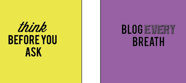
As one of my jobs is creating the actual manifesto flyers i decided to make a list of possible motivational quotes and i began trying them out with our typefaces and colour choices.
I started putting the quotes into illustrator in small flyer style page documents and testing the typefaces and colour choices.
we decided that the black text on the fluro colour worked best and was most appropaite
We felt that the white type was better on purple and the text centre aligned to keep the consistency.
The white text also worked best on the orange it made the type more legible and bright.
GEOMETRIC PATTER BACKGROUND-
I found a geometric pattern and traced out the shapes i made it fill the a2 page which the consantina flyers would go on. This was so when the flyers were folded the back wasn't just white or black.
Putting them together:-
I wanted all of the flyers to fit on to one large A2 document so we could print it double sided.
I started filling in the boxes with each list a different section each strip would be a constantina.
I made sure each strip had the type in the middle and was in line.
I added the purple colour to the strip after making sure everything was in the right place.
using the 'Sullivan' type was the hardest as when it was the same pt size and the other typeface i was using it looked a lot smaller so i had to keep adjusting to make it fit the text.
I was really pleased with the constantinas i had created i felt the worked really nice as a set.
Business cards and extra posters -
These are the paper sizes for the business cards and to small posters which just advertise the key and our blog and instagram.
THE BLOG -
The very top of the blog has our logo the key in monochrome.. i decided to reuse the pattern i had created and make this to add to the homepage but when jnae tried to up load it to the blog it was unsuccessful and didn't look right..
I decided it would be beneficial to use the same information but in a different way so i made 3 posters with the information and just loose the monochrome pattern.
As we were using tumblr i thought the posters could be posted as images and run across the middle i think this worked really well.
We had a page for dos and fonts and manifesto and inspiration so we changed the dos and donts and put them onto one page. that way we could put our own manifestos with the designer manifestos and our flyers.
For the inspiration page we added oscar wilde quotes we also added inspiration blogs and links for people to have a nosey and get inspired.
MANIFESTO-
Me and jnae both wrote our own 500-600 word manifesto to go onto the blog. I loved writing this its nice to share with the new students what you experienced the first year and your advice for them.
Congratulations you made it! The first year is going be a
rollercoaster and an amazing experience. Its lot of hard work but your going to
get some amazing results if you put the time and effort in. What I learnt this
year...
Stress
stress stress! Being stressed can motivate you, Its okay to be a little
stressed there’s been times when I never thought I would finish a task or a
brief but with persistence and effort I have finished everything on time and
been really pleased with my final product.
Blog
everything and blog some more - When I first started Leeds College of Art I
blogged everything that was said or done it’s a really good habit to get into.
A real big tip would be to create the post on your blog then you know what you
have to do. Blogging’s so beneficial you can document everything and you’ve
always got it there to refer to.
The
deeper you dive the higher you’ll swim – its important to put the effort in
trying your very hardest always ends up with great results. Being the best you
can possibly be in first years puts you in good stead for the next two years
and for the industry. You’ll be amazed at what you can do!
Crit
o’clock – the first time I ever had a group crit would have been at Leeds
college of art and at first they seemed really great everyone telling me my
work was ‘nice’ thanks guys. No! That’s not what you want to hear you need to
receive constructive criticism tell me what I can change, tell me what would
work better, tell me if you think its shit! I would rather know. Crits are really
helpful when you leave knowing you’ve got something to work with and your not
still at square one looking at your ‘nice’ design.
Try
managing your time the best you can and whatever you do, DON’T BE LATE if you
live in Leeds you have no excuse just get up no snoozing your alarm! Be
punctual be 5 minutes early!
No
tears please – There’s been times when I have almost broke down because
something I have done hasn’t got the greatest mark or I thought it was so much
more amazing than it really was. IT’S A LEARNING CURVE put it down to
experience whatever you know - you should of or could of changed do that with
your next brief. You’re here to make mistakes and create amazing and wonderful
things.
Break
time - Give you’re a self break you deserve it – I have found that if I try to do
a certain amount of work a day I cant, I end up the next day then having twice
as much its important to make a list check off what you have done and some
times just have a break completely that way when you go back to doing your work
you’ll have a fresh mind and feel more motivated. Try not to over work yourself
you have plenty of time just use it wisely.
Design
blogs- Design blogs are such a big help when researching. I wish I had known
more blogs before I started the course just to give me a little head start and
to find some amazing work that would later really inspire me. We have created a
little list of the best design blogs on our inspiration page so have a nosey
and get inspired!
We added these with a manifesto by bruce mau and dieter rams.
PLAYLIST -
I asked people in the class what music they listen to whilst working we used this to make our motivational playlist which we would burn to a cd.
CD FOR TEMPLATE PLAYLIST -
I created a cd template for our cd on illustrator.
I added our logo to the centre of the cd cover.
I tested our colour theme but decided to stay with the white.
PACKAGING-
For the packaging i decided to get a book out of the library to help me..
I chose this specific design i put it into illustrator and then filled it in black as the template was only lines and wasn't a shape it was really difficult to fill it in. I printed it out and made prototypes to make sure it definitely worked.
I preferred this design the most and it would of fit everything in.. jnae didn't like it that much so we tried another design. testing different prototypes is always good so you can get a variety.
This design was to complex so we used a default template which was straight forward we put our logo on the top in orange and printed it on a2 card the stock wasn't very nice and scratched really easy.
The original packaging turned out to be a fail and wouldn't fit everything in so we decided on creating our final packaging using black card and using an old brown paper bag to mark up a template. I decided to cut off 'The Key' title off our old box and stick it on top of our new box. i pierced holes in it and we tied it with ribbon me and jnae both made one each.c
BELLYBANDS -
I also made belly bands to go around the flyer constantina packs.. I first created a key using shapes.
I used one of the flyers to measure the width and a rectangle shape and repeated it so that it would fit the width and actually tie around the flyers..
I first placed the key in the centre but felt it would look better on the end that way the key could be locking every together and the front of the belly band would just be black and plain.
THE FINAL PRODUCT:-


