Tuesday, 15 January 2013

Colour part 3 & 4 - Colour and Contrast , Subjective Colour

Colour and Contrast
  • Additive gives you white
  • Subtractive gives you black
colour wheel


Because of the physiological response the eye can be fooled into seeing the full range of visible colours through the proportionate adjustment of just three colours green and blue.

Ittens 7 Contrasts
  • Contrast of TONE-Formed by the juxtaposition of light and dark values.This could be monochromatic - BLACK OR WHITE - ONE COLOUR The higher contrast is black to white. based on colour values.
  • Contrast of HUE-Formed by juxtaposing of different hues.The greater the distance between hues on a colour wheel the greater the contrast.

Legibility and readbility - you can read the word (in yellow) better on a black background compared to white. The words are all the same weight and style.
  • Contrast of SATURATIONS -Formed by the juxtaposition of light and dark values and their relative saturations
The darkest yellow in the middle becomes the most clear all the other colours become tones and tints.
  • Contrast of EXTENSION - Formed by assigning proportional in relation to the visual weight of colour.Also known as the contrast of proportion.

The amount of colour next to the another colour changes how we perceive it. how much yellow can we put down to create a visual balance.


For eg. If we have a block of colour , its fairly balanced & comfortable.
  • Contrast of TEMPERATURE - Formed by juxtaposing hues that can be considered ‘warm’ or ‘cool’. Also known as the contrast of warm and cool.
coolest is blue , warmest is orange
We've isolated these colours the black bands have split the colours up you can only see hue & tone. As you go through theres a distinction through the colours.
once the black lines are gone you can see gradients.
  • COMPLEMENTARY contrast - formed by juxtaposing complementary colours from a colour wheel or perceptual opposites.\

Tonal contrast between black and white , if you put things that are opposing together the exact thing happens if you put red and green together. They are the most extreme contrasts.
  • SIMULTANEOUS CONTRAST - Formed when boundaries between colours perceptually vibrate.
putting colours next to each other that will have the highest impact , Yellow block with mid green on top - the yellow starts to blur and merges into the green, its starting to shift into a more orange colour. Yellow which is a primary and green which makes blue. were missing red our eyes start to introduce the absent colours.More blue starts to come out of the green. 


Its based on the idea that if you put certain colours together they contrast.

Part 4
Subjective colour


The yellow is jumping out. When its reversed its not the best composition. When its small still high impact.


Colour starts to control its surroundings. Neutral grey mixed in illustrator. Because yellow needs its complimentary.  When you start to stare to the left theres a violet tinge. When looking at the right the blue is more pronounced because its closer in tonal values. The blue thats there needs its complimetary for us to read it. 


More desaturated , The colour of the line never changes optically it does but there is only 3 colours there and not 4.
The more you look at it the more violet it becomes.


Thursday, 10 January 2013

Adobe Indesign workshop 10.01 & 17.01

Adobe Indesign workshop
Adobe indesign is used for printing and is used in the industry properly more advanced than illustrator.
Theres many similarities as photoshop and illustrator (tool bar).


Creating a new document FILE>NEW>DOCUMENT
We are selecting to print.
The page is the size of whatever your going to print.

We next selected more options which gives us additional options.
giving the options to...
We can select a set amount of columns and change the gutter ( the space between the columns).
Bleeding is used for images and text to run off the page.

Always selecting 3mm
Selecting facing pages , like a book. on the screen the pages will face.
If a mistakes been made when creating the document you can click file  > document setup- You can change layout settings margin and bleeds all of them options are changeable once you have setup your document.


You can view how many pages you have in the pages column you can add and delete them. We repeated this process but making a new document and selecting facing pages.

You can select layout > for grids and guides.
We filled a text box with > PLACE HOLDER TEXT. so that we can see what it would look like.(dummy text)


In design work shop 17.01


If i  have a missing link in design a red hexagon will appear to show you.

This was an old option to help manage your image

We added in a photo from the user work called cardinle large. we placed the photo and it opened up large over the size of my a4 doc. to make the image smaller i first clicked on the circle in the middle of the photo and then dragged the corners holding shift so that it would resize.

we right clicked and looked at the edit with option it didn't have photoshop selected as the deafault so we wanted to change this. 


We found the cardinal.tif in the finder and pressed apple button and i this brought all of the information up. We then changed the edit option to photoshop.


Now the edit with button will always lead to adobe photoshop (deafault.)

We then had the image in photoshop and we changed the percentage and made the with and heigh both 29. We then also made sure the image was CYMK available for print.

We next got an image of a gull and put it into photoshop unlocking the layer, we used the lasso tool and selected the area around the gull.
We inversed the image and pressed delete this deletes the outside of the image.

Tuesday, 8 January 2013

Colour theory systematic colour part 1 & 2

Systematic colour

colour is perception how we see it and think , it changes constantly. We need to find systematic ways.
Colour started in the 1700's painters , scientists colour mixing.
different colours have different properties , the higher the wave length the closer to red we see and the lower the closer to blue. 


  • The eye contains two kinds of receptors : rods and cone
  • While the rods convey shades of tray the cones allow the brain to perceive colours
  • Of the three types of cones the first is sensitive to red-orange light , the second to green light and the third to blue-violet.
When a single cone is stimulated the brain perceives the corresponding colour.

  • If our green cones are stimulated we see "green".
  • if our red-orange cones are stimulated we see "red"
Primary colours can't be made by other colours. mixing primary colours you get your secondary.
Colour Modes - Primary colours RED GREEN BLUE.

Colour Modes - cyan magenta yellow black (CYMK) black is the key adds tone.

  • The eye cannot differentiate between sectorial yellow and some combination of red and green.
  • The same effect accounts for our perception of cyan magenta and the other in between spectral colours.
Because of this physiological response the eye can be "fooled" into seeing the full rage of visible colours through the proportionate adjustment of just three colours red green and blue


Subtractive colour mixtures of cyan magenta and yellow to produce blue green and red..


                                            Subtractive colour                                    Additive colour

complimentary colours cancel each other out.

Chromatic value = hue + tone + saturation

If you want to work with colour in design its has to be systematic.

Over our time off we were asked to collect 15 objects and given a colour my colour was green. We placed our colours on the desk in a large square making a colour circle. The colours were orange red purple blue green and yellow.


There was a few people sat around each colour we then had to pick 7 of the objects that where:

Brightest-string
Dulest-sponge
Palest-tissue
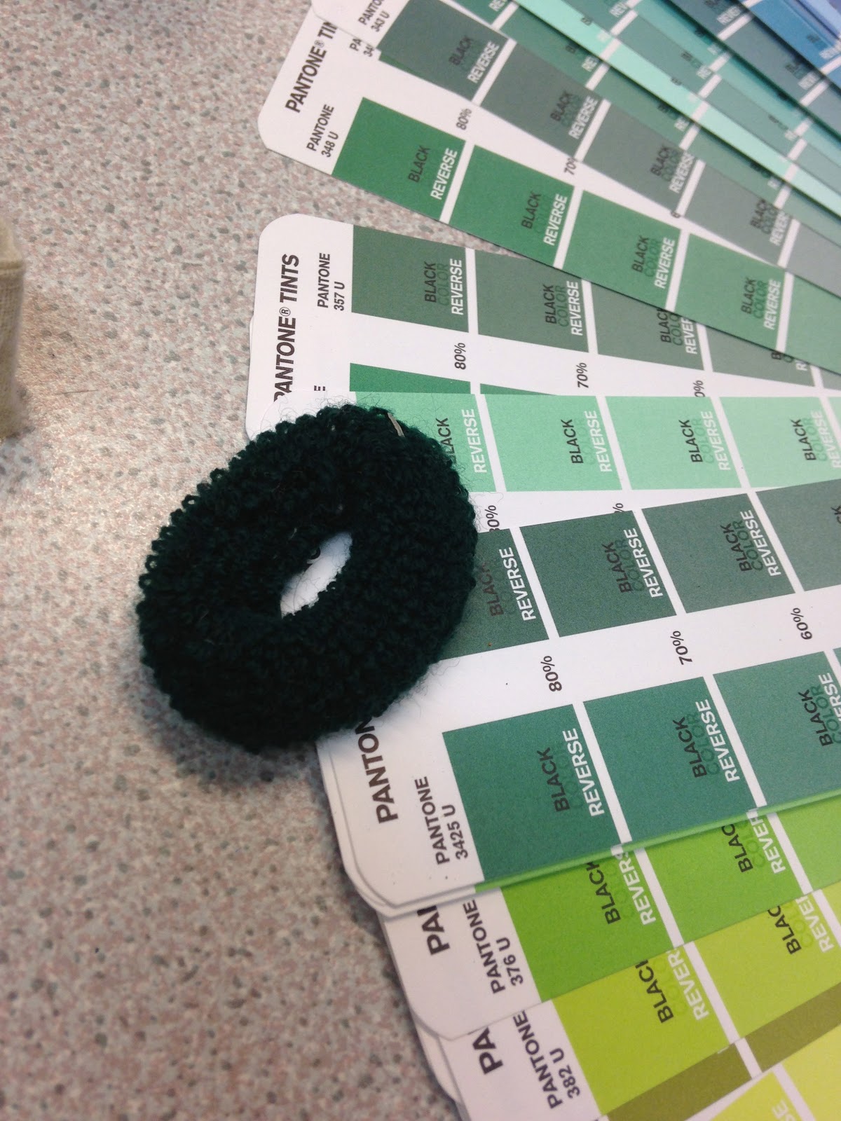
Darkest-Hairbobble
Yellowist-River island bag
Bluest-Folder
Greenest- Card


Yellowist - River Island Bag - 809c 80% Palest- Tissue 356c 30%


Folder - 7474c 80% String - 802c 70%


card-245 60% - Sponge top - 3435U 60%


Hair bobble- 3435 80%